Mega Menu
The Mega Menu is a Header block that creates a large dropdown navigation panel for specific menu items. It allows merchants to display categories, brands, featured products, promotional imagery, and marketing messages in a structured layout when customers hover over a navigation link.
Multiple Mega Menu blocks can be added within the Header section, allowing different navigation items to display their own unique Mega Menu content.
Adding a Mega Menu
To create a Mega Menu, add a Mega Menu block inside the Header section and configure the settings below.
- Go to Shopify Admin → Online Store → Themes.
- Click Customize on the active theme.
- Navigate to the Header section.
- Click Add block and select Mega Menu.
- Configure the settings below and click Save.
Block Settings
Trigger
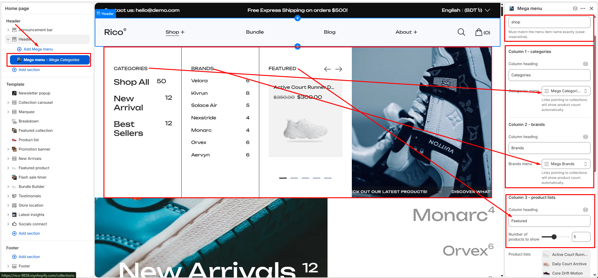
- Nav Link Title: Enter the exact navigation menu item name that should trigger this Mega Menu. Example: If your main menu contains a navigation item named Shop, enter Shop in this field. Important: The value must match the navigation item name exactly (case-insensitive). If no matching menu item is found, the Mega Menu will not appear.
Column 1 – Categories
- Column Heading: Enter the heading shown above the category links. Examples: Categories, Collections, Shop by Category.
- Categories Menu: Select a Shopify menu containing category or collection links. When a link points to a collection, the product count is displayed automatically beside the collection name.
Column 2 – Brands
- Column Heading: Enter the heading shown above the brand links. Examples: Brands, Shop by Brand, Featured Brands.
- Brands Menu: Select a Shopify menu containing brand links. Collection-based links automatically display the associated product count.
Column 3 – Featured Products
- Column Heading: Enter the heading shown above the featured product area. Examples: Featured, Best Sellers, Trending Now, New Arrivals.
- Number of Products to Show: Choose how many products should appear in the featured product slider. Range: 1–10 products.
- Product List: Select the products to feature. Up to 10 products can be assigned; the display limit is controlled by the Number of Products to Show setting. The featured products area displays: product image, product title, product pricing, compare-at price (when applicable), and a direct product link. Customers can browse products using the built-in slider controls.
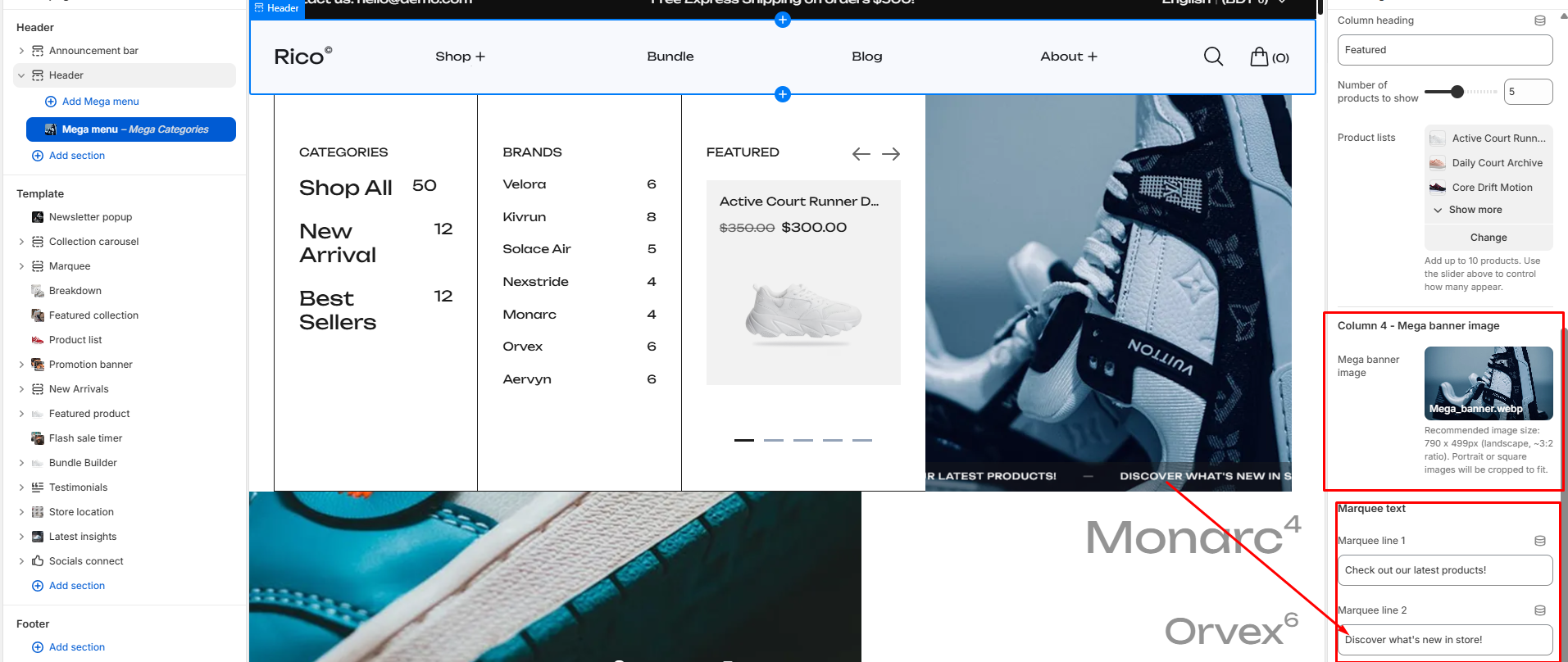
Column 4 – Mega Banner Image
- Mega Banner Image: Upload an image to appear in the banner area. Recommended size: 790 × 499 px (approximately 3:2 landscape ratio). Portrait or square images may be cropped to fit the available space.
- Marquee Line 1: Enter the first promotional message. Default: Check out our latest products!
- Marquee Line 2: Enter the second promotional message. Default: Discover what's new in store! The two messages automatically repeat in a continuous scrolling marquee.
Best Practices
Do
- Match the Nav Link Title with the navigation item name exactly.
- Organize categories and brands into separate menus.
- Feature high-performing or seasonal products.
- Use high-quality landscape banner images.
- Keep marquee messages short and easy to read.
- Create separate Mega Menu blocks for different navigation items when needed.
Don't
- Use a Nav Link Title that does not exist in the navigation menu.
- Overload the featured product area with unrelated products.
- Upload low-resolution banner images.
- Use long promotional messages that are difficult to read while scrolling.
- Leave important content areas empty if the Mega Menu is intended to drive product discovery.
Features
- Header block-based Mega Menu
- Multiple Mega Menu blocks supported
- Hover-triggered dropdown panel
- Category and brand navigation columns
- Automatic collection product counts
- Featured product slider with navigation controls
- Promotional banner image support
- Scrolling marquee messaging
- Keyboard accessibility support
- Responsive layout across devices
- Smooth open and close animations