Collection Carousel
The Collection Carousel section helps you showcase multiple Shopify collections in a visually engaging carousel. Each slide represents one collection with its featured image, title, and product count.
Add the Collection Carousel
- Open Online Store → Themes → Customize.
- Navigate to the page where you want to display the carousel.
- Click Add Section.
- Select Collection Carousel.
- Click Save.
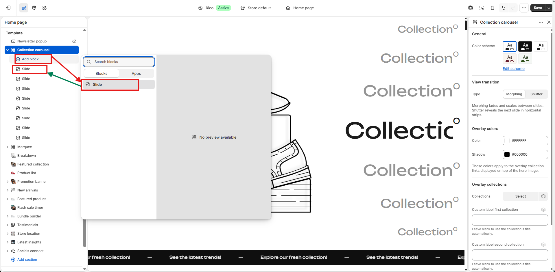
Add Collection Slides
Each slide represents a single Shopify collection.
Steps
- Select the Collection Carousel section.
- Click Add Block.
- Choose Slide.
- Repeat the process to add as many collection slides as needed.
Tip: You can reorder slides by dragging and dropping them in the left sidebar.
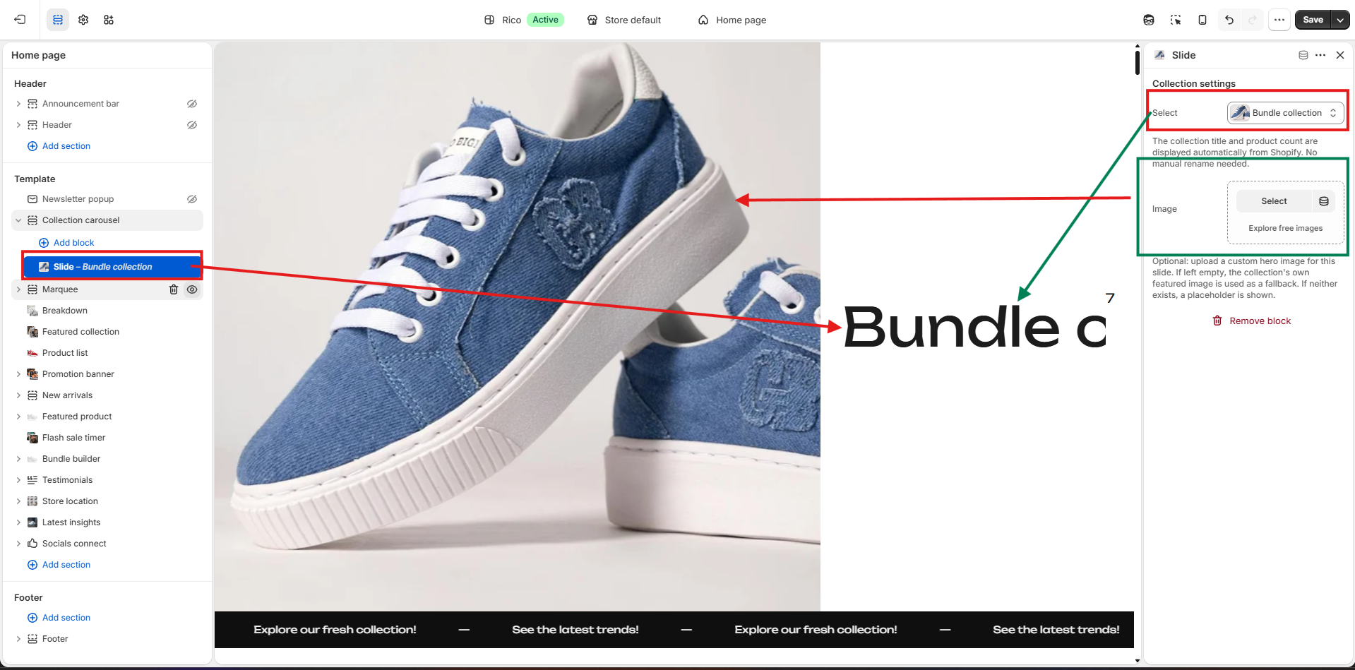
Configure a Slide
Click on any Slide block to open its settings.
1. Select a Collection
- Click Select under Collection Settings.
- Choose the Shopify collection you want to feature.
The following information is pulled automatically from the selected collection:
- Collection title
- Product count
- Featured collection image (if available)
2. Upload a Custom Image
If you want a different banner image instead of the collection's featured image:
- Click Select under Image.
- Upload or choose an image from your Shopify files.
Image Priority
The carousel displays images in the following order:
- Custom uploaded image
- Collection featured image
- Placeholder image (if neither is available)
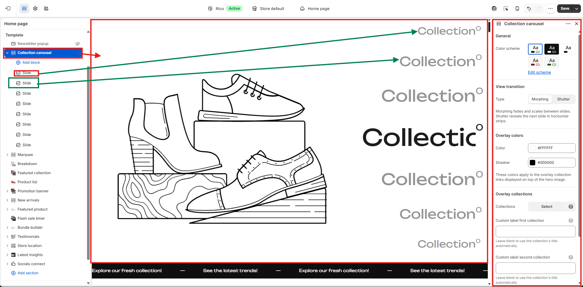
Collection Carousel Settings
Select the Collection Carousel section to customize its appearance.
Color Scheme
Choose a color scheme that matches your store branding. Available options depend on your theme settings.
View Transition
Choose how slides transition.
Morphing
- Smooth fade and scale animation
- Modern visual effect
Shutter
- Horizontal reveal animation
- More dynamic slide transition
Overlay Colors
Customize the collection title overlay. You can change:
- Text color
- Shadow color
These settings improve readability over different images.
Overlay Collections
You can customize the labels shown on top and bottom of the carousel.
Collections
Select up to two collections to display as overlay navigation on top of the carousel image. Each selected collection shows:
- Collection title (or custom label)
- Product count — pulled automatically from the selected collection.
Custom Labels
Optionally replace the automatic collection title with your own text. If left blank, the actual Shopify collection title will be displayed automatically.
Best Practices
Do
- Use high-quality, consistently sized images across all slides to keep the carousel looking polished and uniform.
- Upload a custom image for each slide if your collections do not have a strong featured image set in Shopify.
- Keep collection titles short and descriptive so they read clearly in the overlay without being truncated.
- Test both Morphing and Shutter transitions to see which feels right for your store's overall tone and style.
- Use the overlay collection labels to highlight your most popular or seasonal collections for quick navigation.
Don't
- Add too many slides — a long carousel can feel overwhelming. Aim for a focused selection of your key collections.
- Leave slides without an assigned collection — they will show a placeholder image and no meaningful content.
- Use overlay text colors that are too similar to your image tones, as this makes the labels hard to read.
- Rely solely on the collection's featured image if it has not been set in Shopify Admin, as a placeholder will appear instead.
- Set custom labels that are too long — they are displayed in a small overlay and may get cut off on smaller screens.