Product Card
Configure how product cards look and behave in your store.
Card Settings
- Hover style: Controls the animation when customers hover over a product card. Options: Slide — content shifts with a sliding effect; Flip — the card flips to reveal more information.
- Flip effect: Controls the animation style when Hover style is set to Flip. Options: Fade — smooth fade between front and back card content; Flip — card-flipping animation between front and back. This setting only applies when Hover style is set to Flip.
- Reverse price order: Reverses the display order of product prices (for example, shows compare-at price before sale price, or vice versa, depending on your implementation).
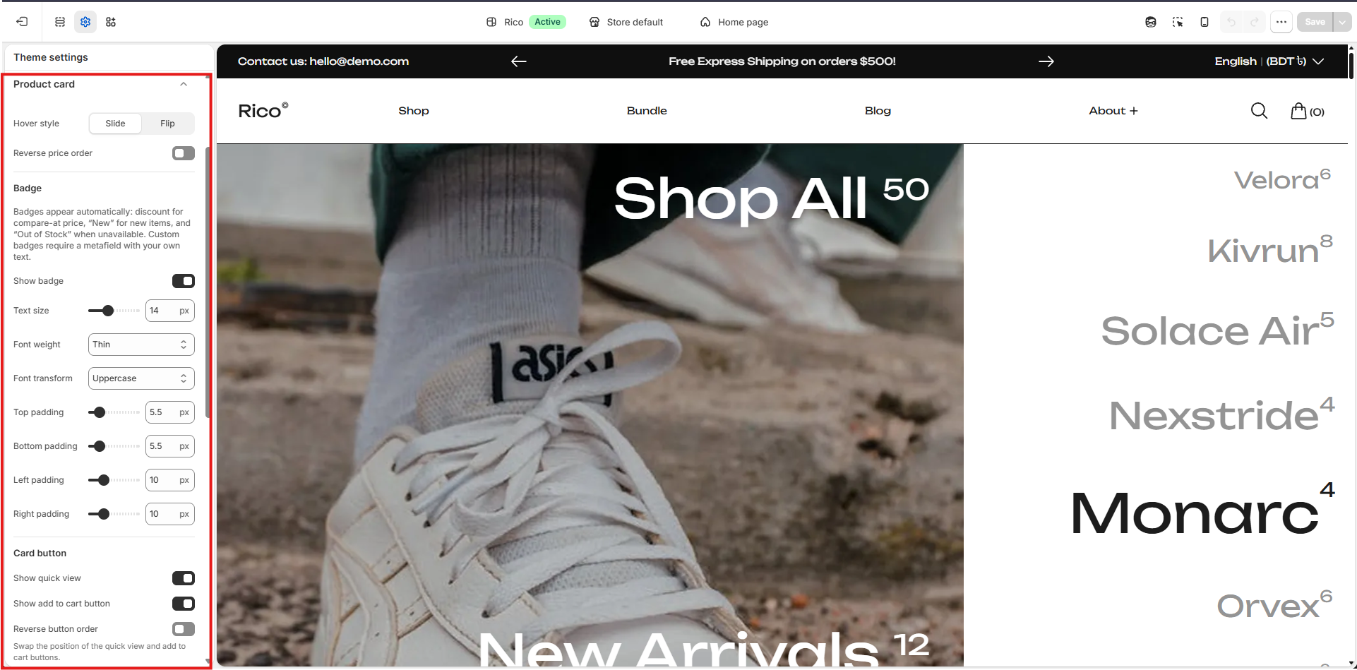
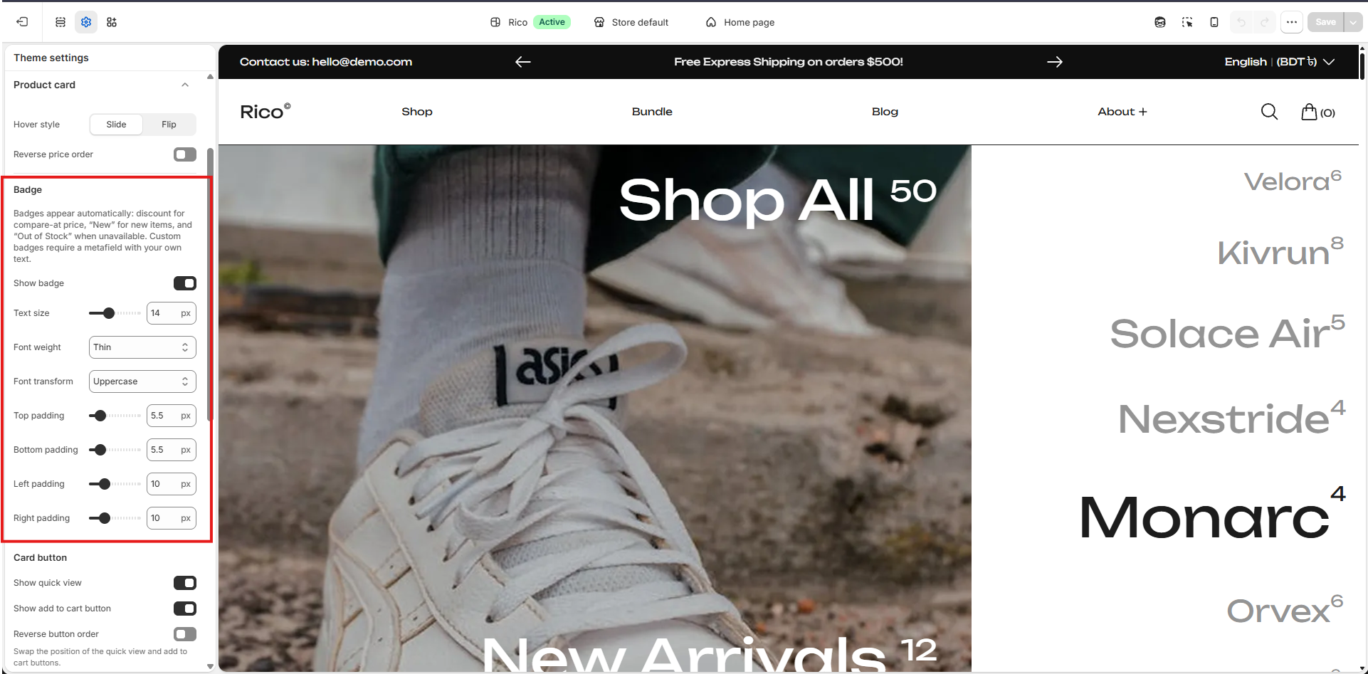
Badge Settings
Badges are displayed based on specific conditions. If a product has a compare-at price, a discount badge will be shown. If the product is new, a New badge will appear. If the product is out of stock, an Out of Stock badge will be displayed. For any other custom badges, you must use a metafield, where you can define your own custom text.
- Show badge: Show or hide the badge on product cards.
- Text size: Badge text size in pixels. (Default: 14px)
- Font weight: Thickness of badge text. Options: Regular, Medium, Semi bold, Bold.
- Text transform: Controls the capitalization of badge text. Options: Lowercase, Uppercase, Capitalize.
- Top padding: Space above the badge text. (Default: 4px)
- Bottom padding: Space below the badge text. (Default: 4px)
- Left padding: Space to the left of the badge text. (Default: 10px)
- Right padding: Space to the right of the badge text. (Default: 10px)
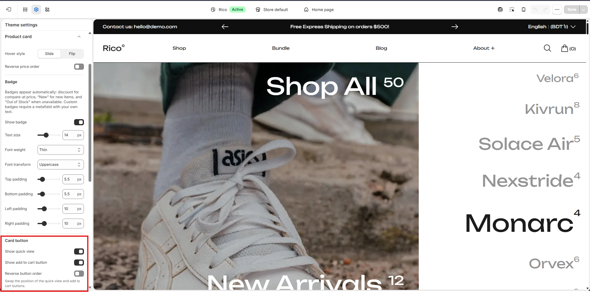
Card Button Settings
Control the product card's Quick view and Add to cart buttons.
- Show Quick view: Show or hide the Quick view button on product cards.
- Show Add to cart button: Show or hide the Add to cart button on product cards.
- Reverse button order: Swap the positions of the Quick view and Add to cart buttons.
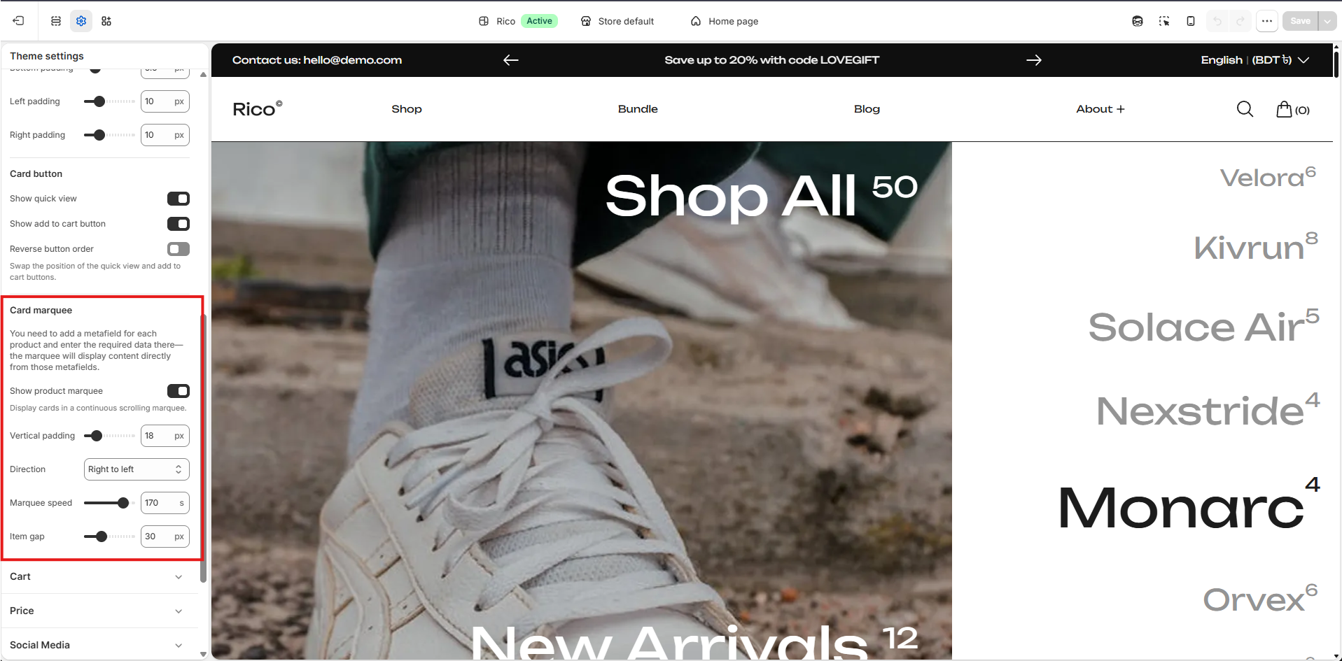
Card Marquee Settings
Enable this to show product cards in a scrolling marquee. The text comes from the product's Marquee metafield. If the metafield is empty, the marquee won't display any content.
- Show product marquee: Enable or disable the scrolling product marquee.
- Vertical padding: Vertical spacing inside the marquee. (Default: 4rem)
- Direction: Sets the scrolling direction of the marquee. Options: Auto, Right to left, Left to right.
- Marquee speed: Controls how fast the marquee scrolls. A lower value is faster; a higher value is slower. (Default: 170s)
- Item gap: Space between product cards in the marquee. (Default: 4rem)