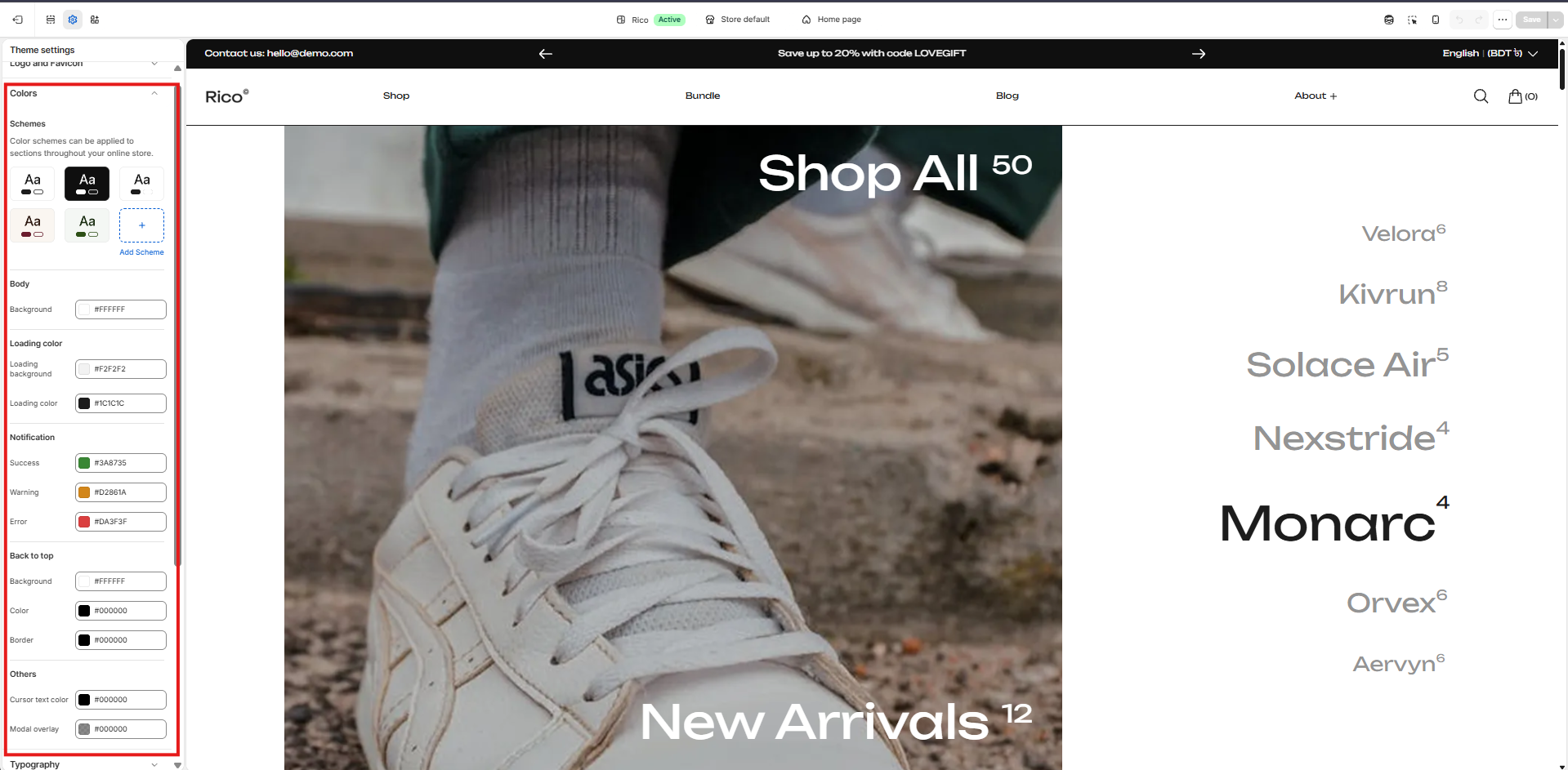
Colors
Customize the colors used throughout your store to match your brand identity.
Color Schemes
Color schemes control the colors used throughout your store. By creating multiple color schemes, you can assign different color combinations to sections and create visual contrast while maintaining a consistent brand identity.
How to manage color schemes
- View or edit: Go to Theme Settings → Colors in the customizer to view, edit, or create color schemes.
- Add a new scheme: Click Add Scheme to create a new color scheme. Once created, you can customize the colors and assign the scheme to supported sections.
- Edit a scheme: Select an existing color scheme to modify its colors. Changes are automatically reflected in any sections using that scheme.
- Apply a scheme: Color schemes can be applied to supported sections across your store — for example, a light scheme for content sections and a dark scheme for promotional banners.
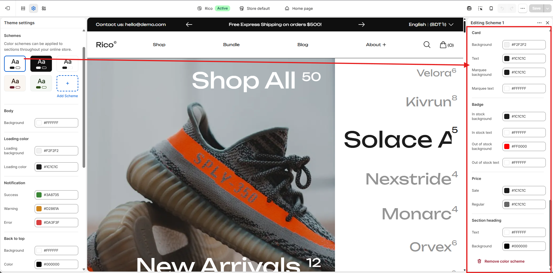
Editing a Color Scheme
To edit a color scheme, go to Theme Settings → Colors and click on the scheme you want to modify. Any changes you make are automatically applied to all sections that use that color scheme.
Background
- Background: The primary background color for sections using this scheme. (Default: #FFFFFF)
- Foreground: The foreground surface color used within the scheme. (Default: #F2F2F2)
- Background Gradient: Optional gradient that replaces the solid background color when configured.
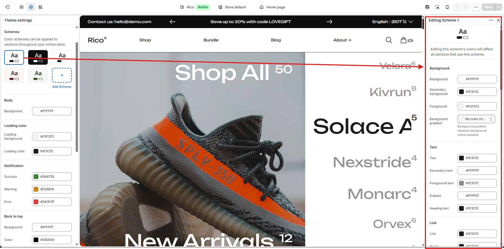
Text
- Text: The primary text color. (Default: #1C1C1C)
- Secondary Text: Used for supporting or less prominent text. (Default: #FFFFFF)
- Link: Color used for text links. (Default: #1C1C1C)
- Hover: Color used for interactive elements on hover. (Default: #1C1C1C)
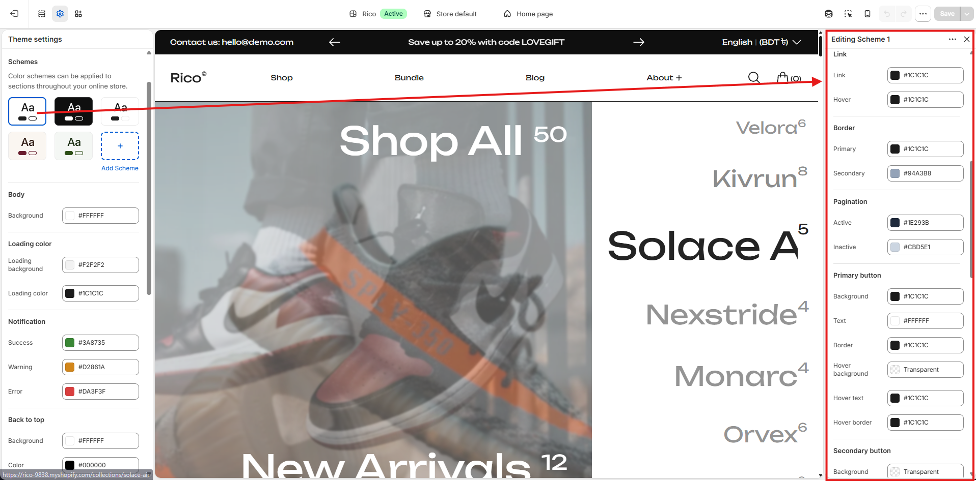
Primary Button
- Background: Button background color. (Default: #1C1C1C)
- Text: Button text color. (Default: #FFFFFF)
- Border: Button border color. (Default: #1C1C1C)
- Hover Background: Button background color when hovered. (Default: Transparent)
- Hover Text: Button text color when hovered. (Default: #1C1C1C)
- Hover Border: Button border color when hovered. (Default: #1C1C1C)
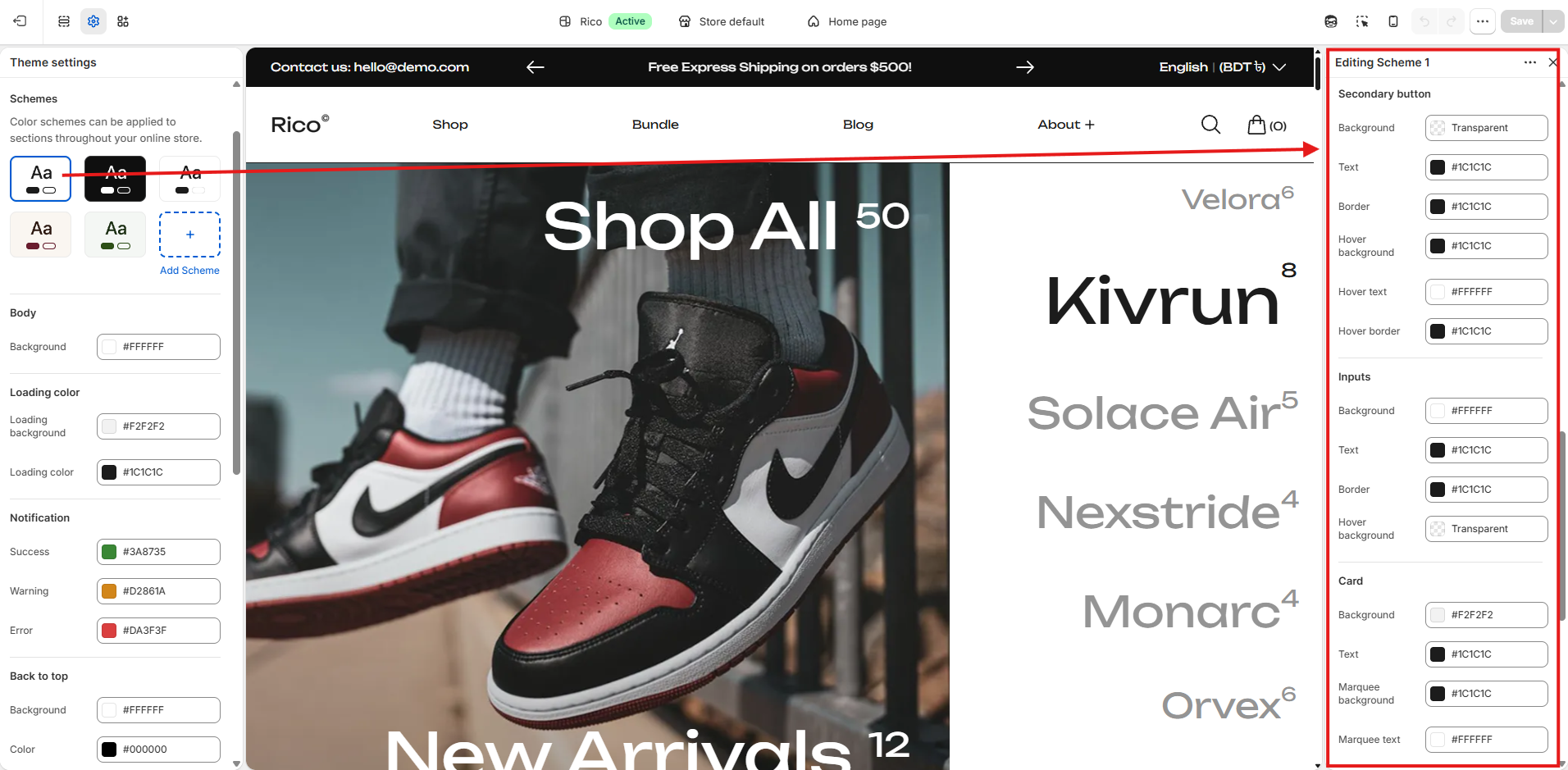
Secondary Button
- Background: Button background color. (Default: Transparent)
- Text: Button text color. (Default: #1C1C1C)
- Border: Button border color. (Default: #1C1C1C)
- Hover Background: Button background color when hovered. (Default: #1C1C1C)
- Hover Text: Button text color when hovered. (Default: #FFFFFF)
- Hover Border: Button border color when hovered. (Default: #1C1C1C)
Section Heading
- Text: Section heading text color. (Default: #FFFFFF)
- Background: Section heading background color. (Default: #000000)
Tips for using color schemes
- Create multiple schemes to give different sections their own visual style while maintaining brand consistency.
- Use high contrast between text and background colors to improve readability.
- Preview changes across different sections to ensure colors remain accessible and visually balanced.
Removing a Color Scheme
To delete a color scheme, open the scheme and click Remove color scheme at the bottom of the editor. Any sections currently using that scheme should be reassigned to another color scheme before removal.
Loading Colors
- Loading Background: Sets the background color shown during the loading state.
- Loading Color: Sets the color of the loading indicator displayed while content is loading.
Other Colors
- Modal Overlay: Controls the color of the overlay displayed behind modal windows, popups, quick views, and other overlay-based components.