Collection Page
Display all products inside a collection in a filterable, sortable grid with instant updates, active filter tags, and a collection navigation bar.
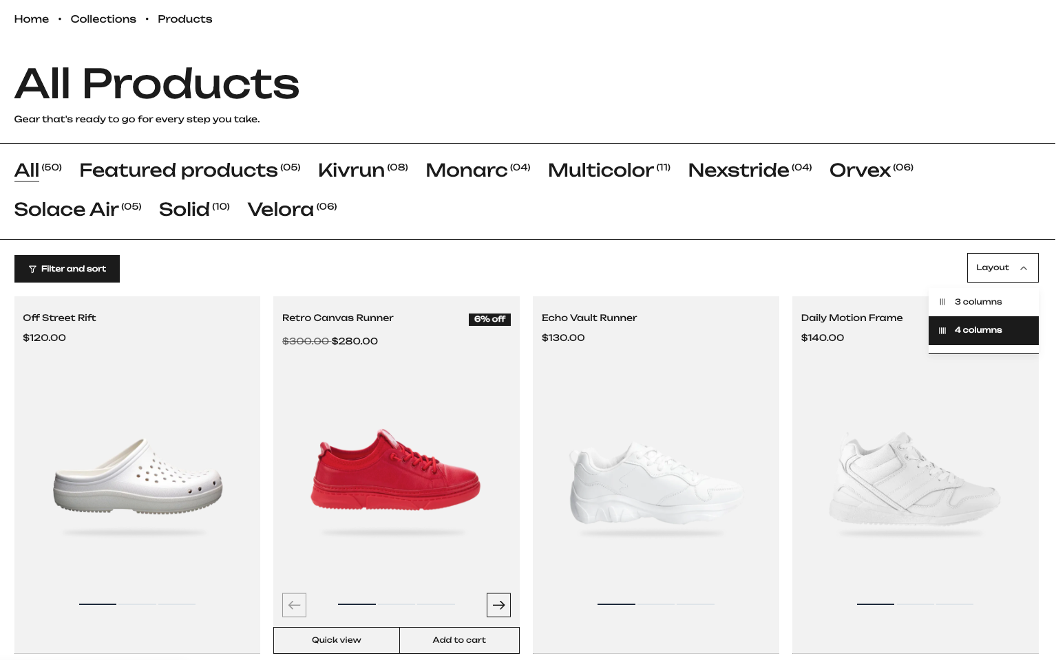
The Collection Page displays all the products inside a collection. Customers can browse products in a grid, filter them by things like color, price, or availability, sort them in different orders, and jump between collections using the navigation bar at the top. The filters and results update instantly without the page reloading.
Section Settings
General
- Color Scheme: Sets the background and text colors for the collection page. Pick a scheme that matches the rest of your store.
- Padding Top / Padding Bottom: Controls the space above and below the section. Set it once for desktop and the theme handles smaller screens automatically.
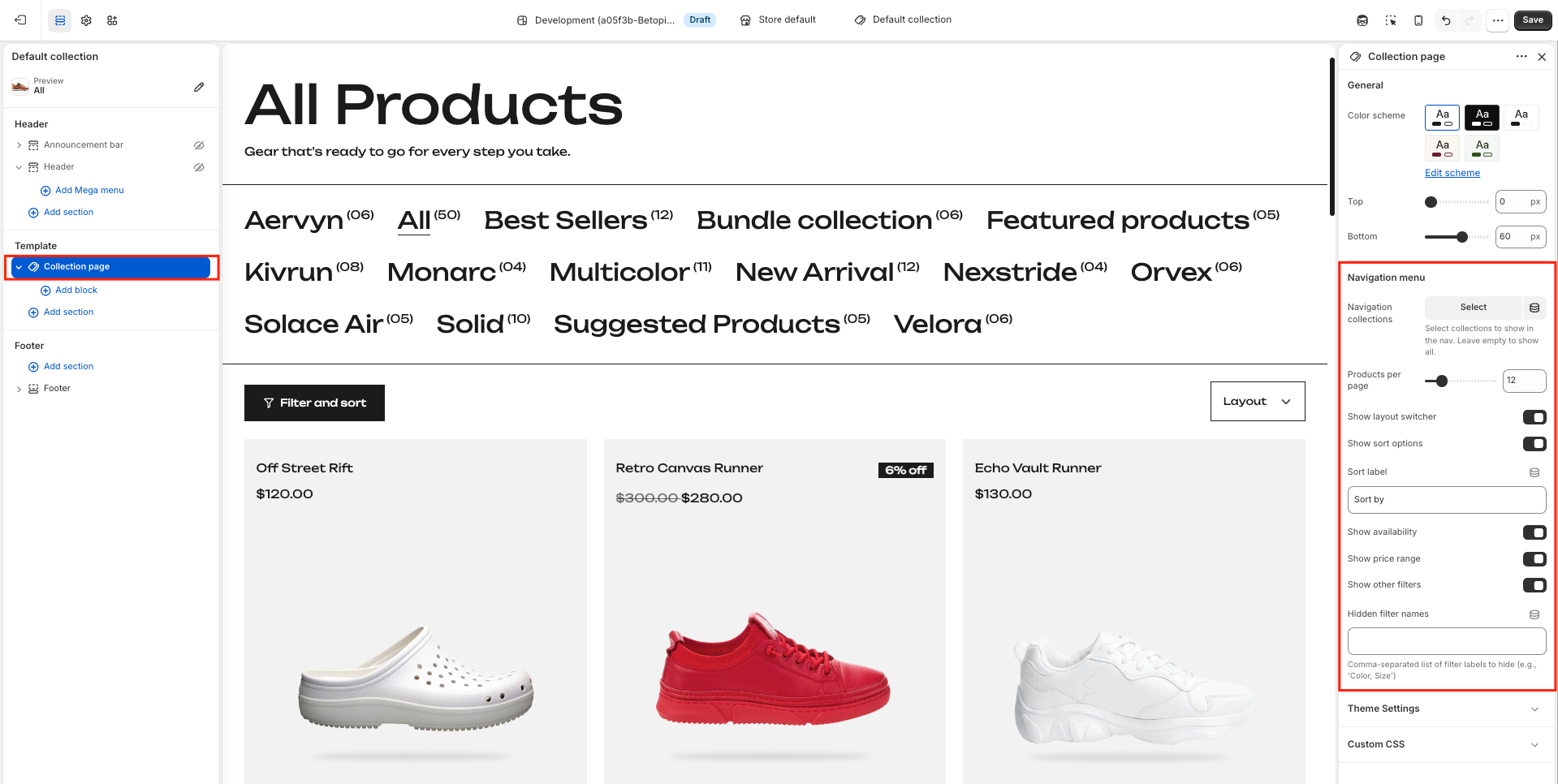
Collection Navigation Bar
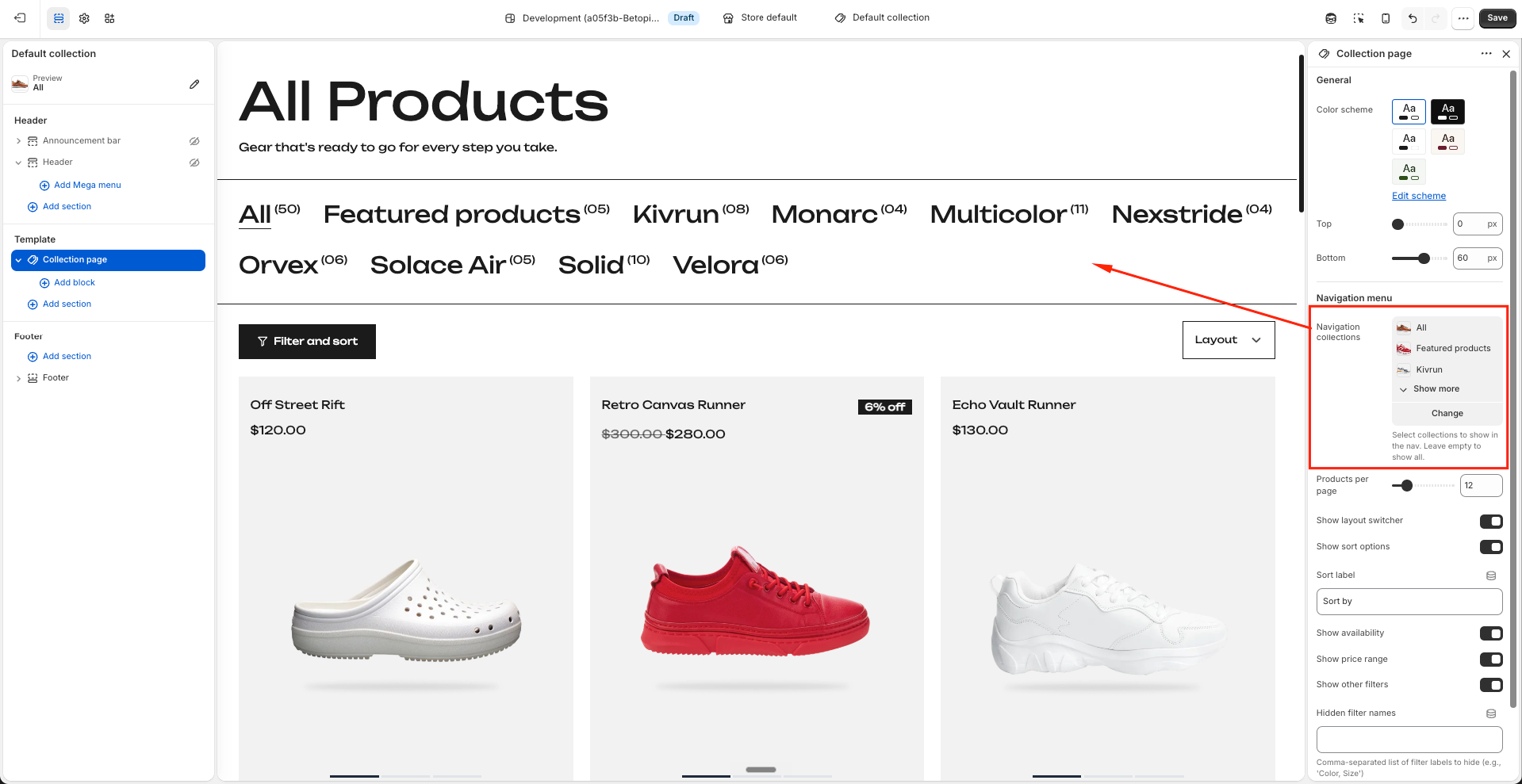
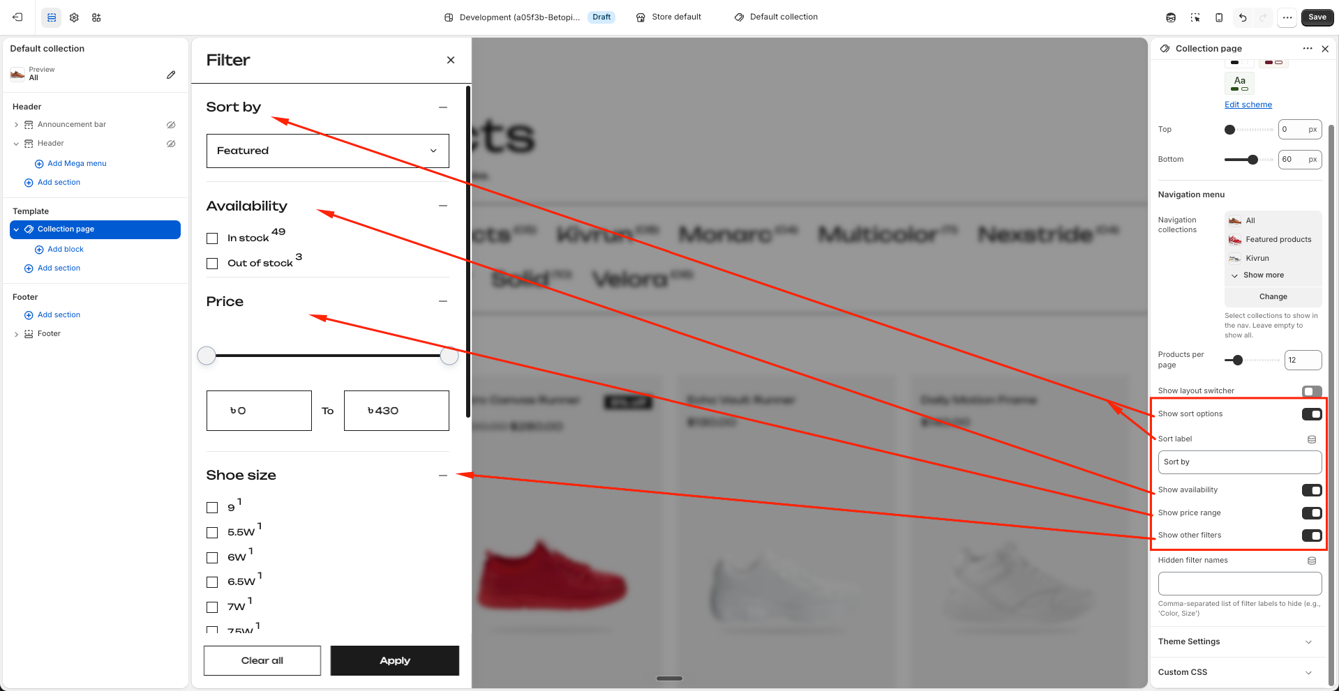
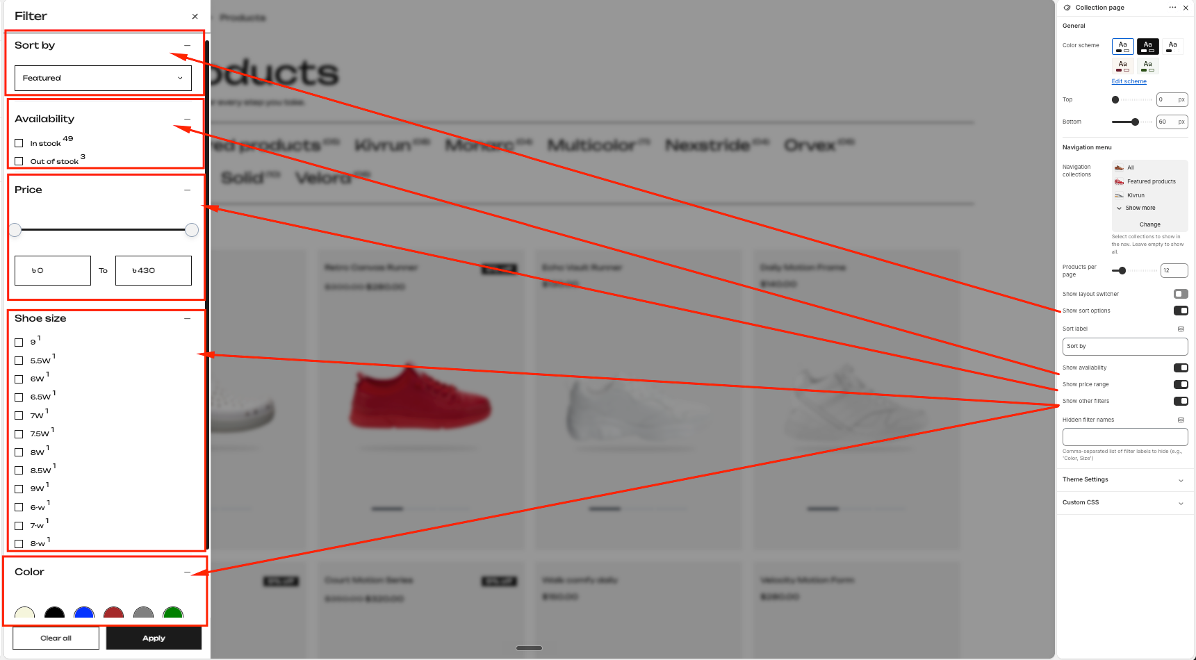
- Navigation Collections: A horizontal row of collection links appears just below the page header. By default it shows all your store's collections. If you only want specific collections to appear, pick them here using the collection picker. Each collection link shows the number of products it contains next to its name. If left empty, all collections in your store will appear in the nav bar automatically.
Products
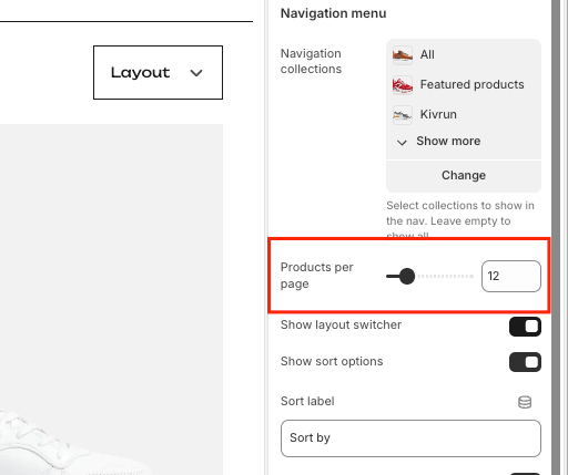
- Products Per Page: Controls how many products are shown before pagination appears. Range: 4–48 products. Default: 12.
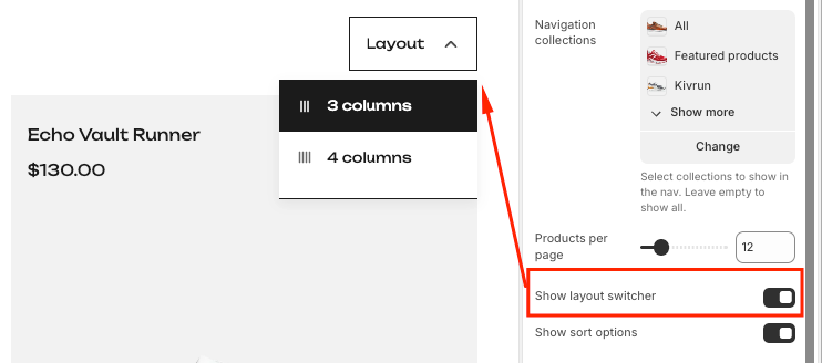
Layout Switcher
- Show Layout Switcher: Turns on a dropdown in the toolbar that lets customers switch the product grid between a 3-column and 4-column layout. The customer's chosen layout is saved in their browser. Turn this off if you prefer a fixed layout.
Sorting
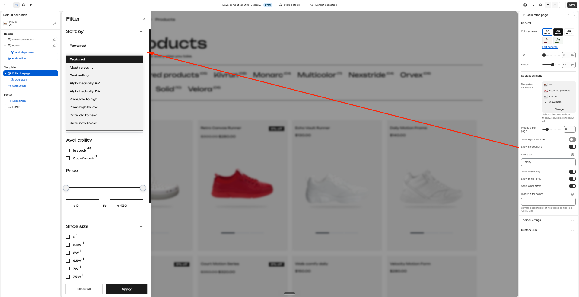
- Show Sort: Shows or hides the sort option inside the filter drawer. When turned on, customers can sort products by things like price, date, or best selling.
- Sort Label: The heading text shown above the sort dropdown inside the filter drawer. Default: "Sort by". You can change this to anything you like, for example "Order by" or "Arrange by".
Filters
- Show Availability: Shows or hides the Availability filter, which lets customers filter by In Stock or Out of Stock.
- Show Price: Shows or hides the Price filter. When visible, customers can drag a slider or type a min and max price to narrow down results.
- Show Other Filters: Shows or hides everything else — things like Size, Category, Material, or any other filters configured in the Search & Discovery app.
- Hidden Filters: If you want to hide a specific filter without turning off the whole group, type its exact name here. Separate multiple names with a comma — for example: Brand, Color. The names must match exactly what appears in your Search & Discovery app.
Filter Drawer
The filter drawer opens as a side panel when a customer clicks the Filter & Sort button in the toolbar. All filtering and sorting happens inside this panel.
What customers can do inside the drawer
- Sort: Choose how products are ordered. Options like Price: Low to High, Best Selling, and Newest are shown depending on what you have enabled in Shopify Admin.
- Availability: Tick In Stock to only show products that are available to buy right now.
- Price: Drag the slider handles or type values into the min and max fields to show only products within a price range.
- Color: Color filters appear as circular swatches. Customers tap a swatch to filter by that color. The color shown is matched automatically from your theme's color palette settings.
- Other filters: Any additional filter groups from your Search & Discovery app (such as Size or Category) appear as a list of checkboxes. Ticking one narrows down the results immediately.
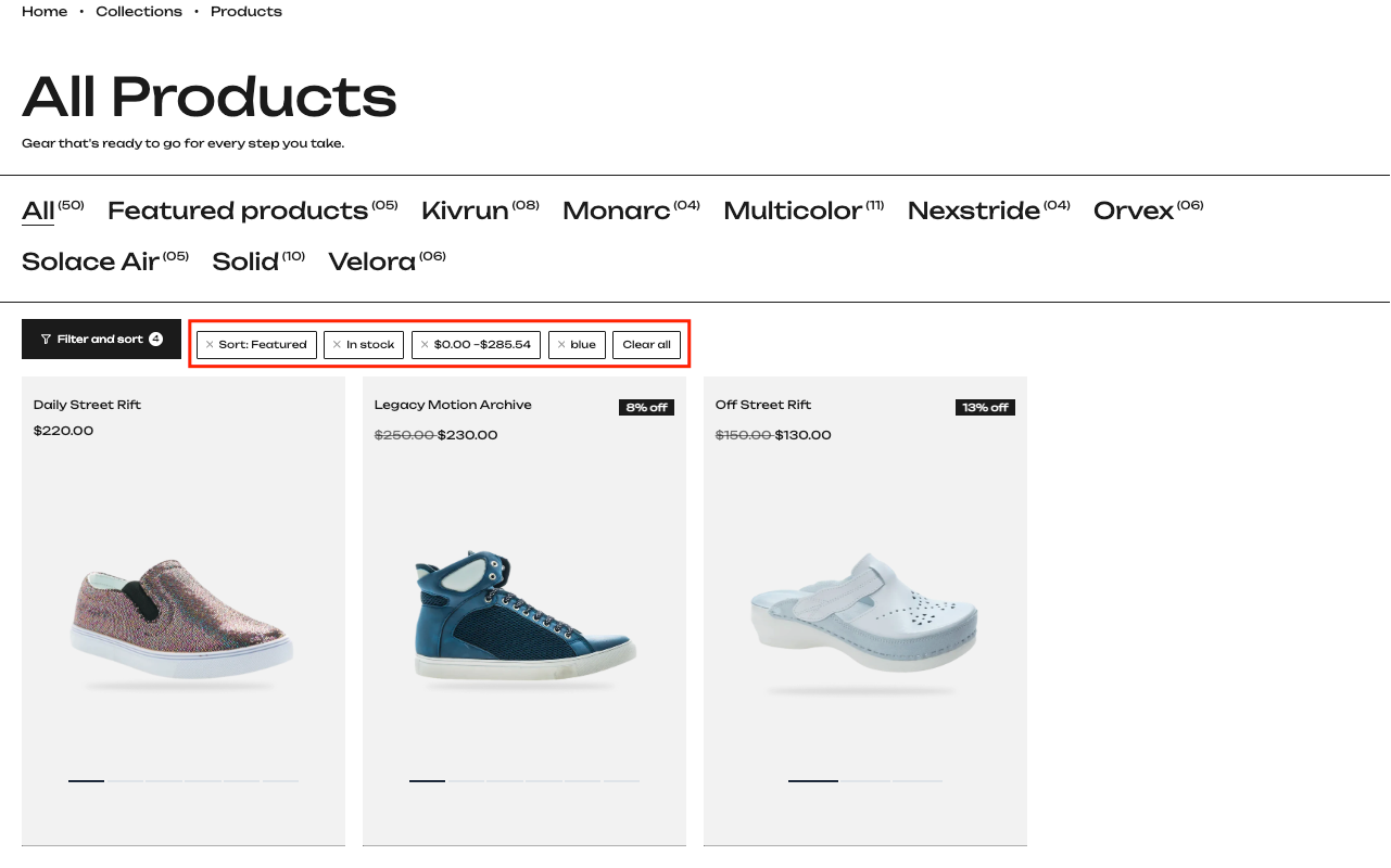
- Clear All: A button at the bottom of the drawer removes all active filters at once and resets the grid to show all products.
- Apply: Closes the drawer and confirms the current filter selection.
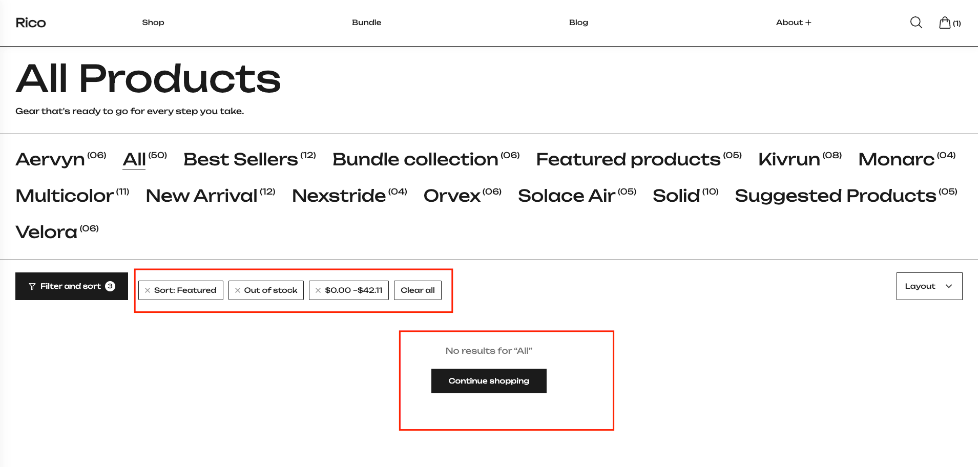
Active Filter Tags
When a customer has filters active, small tags appear in the toolbar showing what is currently applied. Each tag has an X that removes just that one filter. A "Clear all" tag also appears to remove everything at once.
Empty State
If no products match the active filters, the grid is replaced with a short message and a button that takes the customer back to the all-products collection.
Best Practices
Do
- Use the Hidden Filters field to tidy up the filter drawer if you have filters that are not relevant to a particular collection.
- Keep the Sort Label short so it fits neatly inside the drawer header.
- Test the filter drawer on mobile before publishing — the panel takes up the full screen on smaller devices.
- If you want more control over which filters appear and how they are ordered, you can optionally install the Shopify Search & Discovery app — but the filters work perfectly without it.
Don't
- Turn off Show Others if you have custom filters like Size or Material set up — they will disappear from the drawer entirely.
- Leave the Hidden Filters field with trailing spaces or wrong capitalisation — the name must match exactly what appears in the filter drawer.
- Set Products Per Page too high if your product cards have videos or large images, as it may slow down the page on mobile.