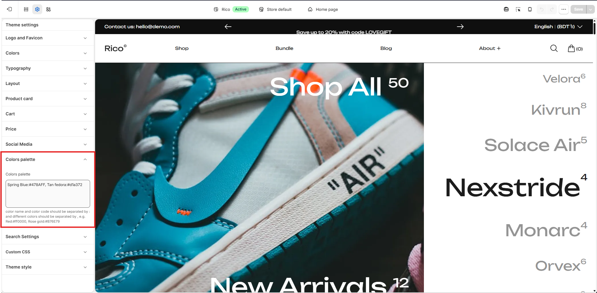
Colors Palette
Define a reusable set of brand colors available throughout the theme.
Color Palette
Define your store's color palette by entering color names and their corresponding color codes. Each color should be entered in the following format: Color Name:#HEXCODE — separate multiple colors with a comma.
Example: Spring Blue:#478AFF, Tan Fedora:#D1A372, Red:#FF0000, Rose Gold:#B76E79
Guidelines
- Use a descriptive color name followed by a colon (:) and the color's HEX code.
- Separate each color entry with a comma (,).
- HEX color codes should begin with # and contain 6 hexadecimal characters.
- These colors will be available throughout the theme for styling elements and maintaining brand consistency.
- Valid example: Primary Blue:#478AFF, Secondary Gold:#D1A372, Accent Red:#FF0000
- Invalid example: Primary Blue - #478AFF | Secondary Gold - #D1A372
Color Settings
Color Schemes
Color schemes control the colors used throughout your store. By creating multiple color schemes, you can assign different color combinations to sections and create visual contrast while maintaining a consistent brand identity.
How to Manage Color Schemes
- Go to Theme Settings → Colors.
- In the theme customizer, open Theme Settings → Colors to view, edit, or create color schemes.
Adding a New Color Scheme
- Click Add Scheme to create a new color scheme. Once created, you can customize its colors and assign it to supported sections throughout the theme.
Editing a Color Scheme
- Select an existing color scheme to modify its colors. Any changes are automatically reflected in all sections using that color scheme.
Using Color Schemes
- Color schemes can be applied to supported sections across your store. For example, you may use a light color scheme for content sections and a dark color scheme for promotional banners, featured collections, or footer areas.
Body
Configure the default colors used for your store's main content area.
- Background: Sets the primary background color for the body of your store.
Loading Colors
Customize the colors displayed while page content is loading.
- Loading Background: Sets the background color shown during the loading state.
- Loading Color: Sets the color of the loading indicator displayed while content is loading.
Notification Colors
Customize the colors used for notification messages throughout the store.
- Success: Sets the color used for success messages and confirmations.
- Warning: Sets the color used for warning and caution messages.
- Error: Sets the color used for error messages and validation alerts.
Back to Top
Customize the appearance of the Back to Top button.
- Background: Sets the background color of the button.
- Color: Sets the color of the icon displayed inside the button.
- Border: Sets the border color of the button.
Other Colors
Additional color settings used by specific theme elements.
- Cursor Text Color: Sets the color of the text cursor (caret) displayed inside text input fields and text areas.
- Modal Overlay: Controls the color of the overlay displayed behind modal windows, popups, quick views, and other overlay-based components. Adjusting this color helps modal content stand out while dimming the rest of the page in the background.