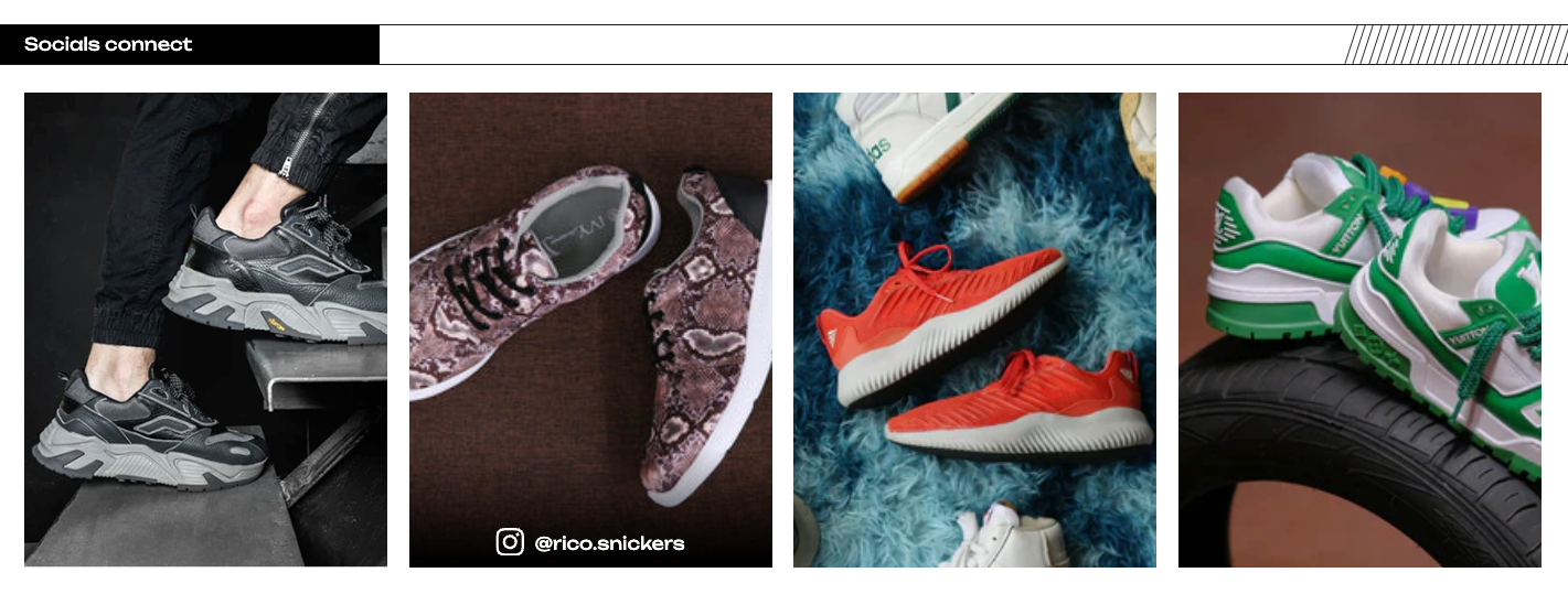
Socials Connect
Display a scrollable gallery of image or video cards to showcase your social media feed, with optional auto-scroll and per-card links.
The Socials Connect section displays a scrollable gallery of media cards — images or videos — typically used to showcase your social media feed or highlight visual content like Instagram posts, reels, or campaign clips. Each card can link anywhere on your site or to an external URL. On mobile, one card takes up most of the screen width at a time. On tablet, three cards are visible. On desktop, four cards are visible. Customers can drag to scroll through the cards, and the section can also auto-scroll automatically on a timer.
How to Edit the Socials Connect Section
Section Settings
- Color Scheme: Choose a color scheme that matches the rest of your store.
- Section Heading: An optional title shown above the card gallery — for example, "Follow Us on Instagram" or "Shop the Look". Leave it blank to hide the heading.
- Layout Direction: Choose whether the cards scroll left-to-right (default) or right-to-left. Right-to-left is useful for Arabic or Hebrew storefronts.
- Card Border Radius: Controls how rounded the corners of each card are. Set to 0 for sharp corners, or increase it for a softer, rounded look. You can also override this per individual card in the block settings.
- Shadow Color & Shadow Opacity: A gradient shadow fades in at the bottom of each card, sitting behind the label and icon. You can change the color and how strong the shadow is. On desktop, the shadow only appears when a customer hovers over the card.
- Label Text Color: Sets the color of the text label and icon shown at the bottom of each card.
- Layout & Spacing: Controls padding and margin around the section. Only set the desktop value — the section scales it down automatically for laptop, tablet, and mobile.
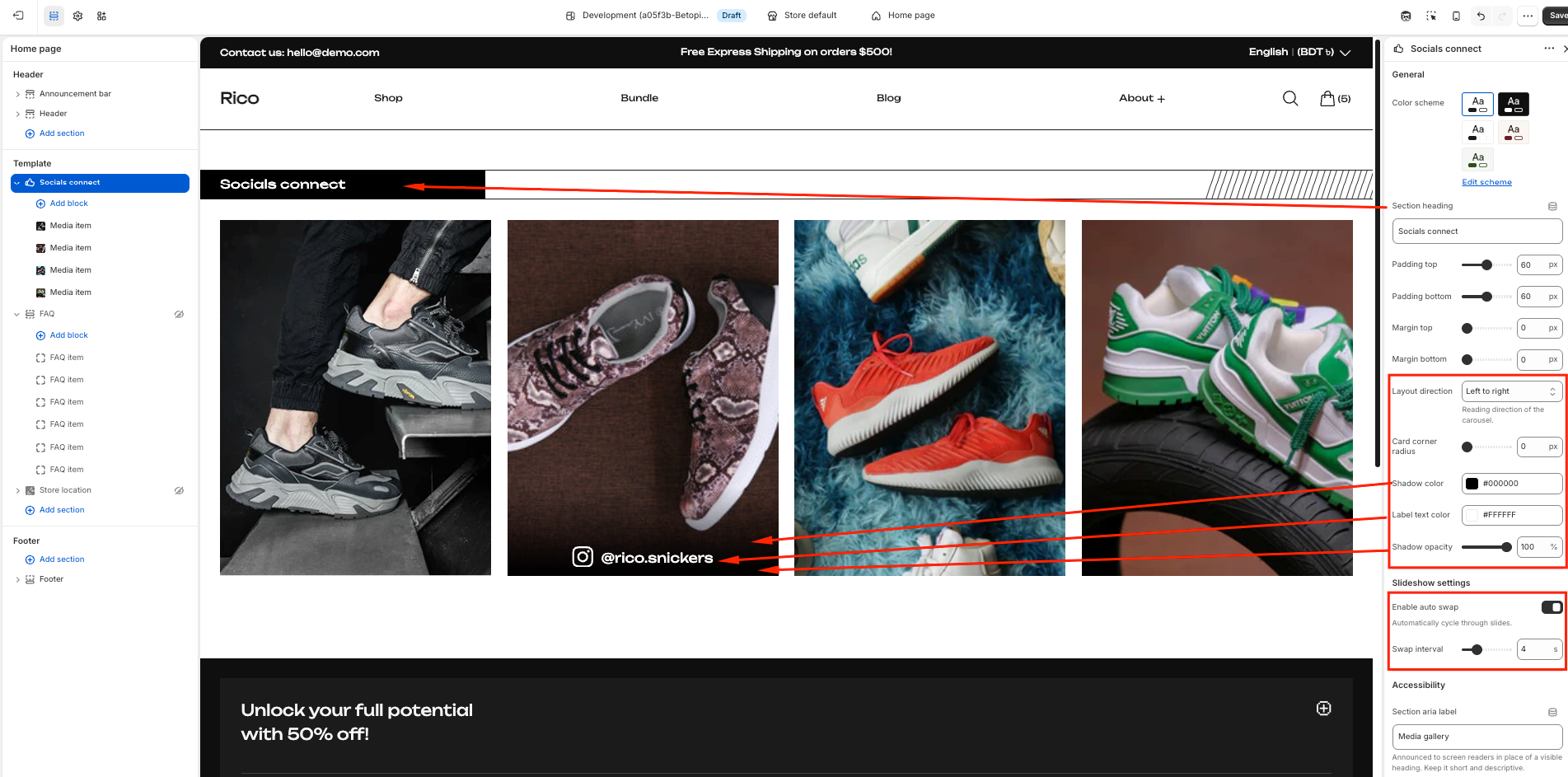
Slideshow Settings
- Enable Auto Scroll: When turned on, the gallery automatically scrolls to the next card after a set time. When turned off, customers scroll manually by dragging or swiping.
- Scroll Interval: How many seconds to wait before scrolling to the next card. Available when auto scroll is enabled. Range: 2–10 seconds.
Auto scroll pauses automatically when a customer hovers over or touches the gallery, and resumes when they move away.
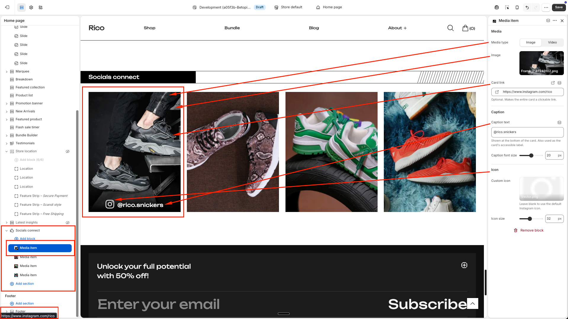
Media Item Blocks
Each Media Item block is one card in the gallery. You can add up to 20 blocks. Click Add block to add a new card.
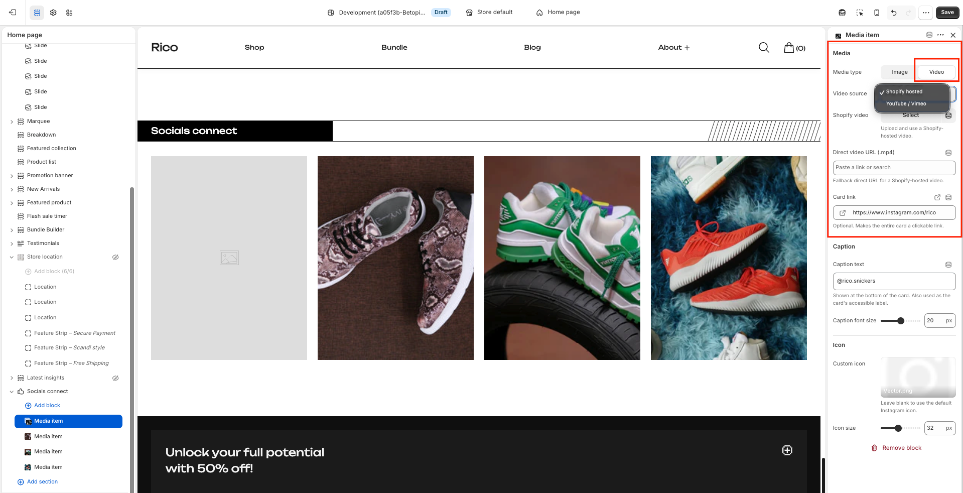
Media Type
- Image: Upload the image you want to display on this card. Use portrait-oriented images for best results — cards have a 3:4 aspect ratio.
- Video — Shopify-hosted: Upload a video directly through Shopify's file manager, or paste a direct video file URL (e.g. a .mp4 link). The video plays automatically, silently, and loops.
- Video — External: Paste a YouTube or Vimeo URL. The video is embedded as an iframe and plays muted and looped in the background.
Card Options
- Card Link: Paste any URL here to make the entire card clickable. This can be a product page, collection, external social media post, or any other link. Leave blank if you do not want the card to be clickable.
- Label: A short text shown at the bottom of the card — typically a social media handle (e.g. @yourbrand) or a short caption. Leave blank to hide it.
- Font Size: Controls how large the label text appears. Range: 10–30px.
- Icon: Upload a small image to display alongside the label — usually a social media logo (e.g. the Instagram icon). If no icon is uploaded, a default Instagram icon is shown automatically.
- Icon Size: Controls the size of the icon in pixels. Range: 14–56px.
The label and icon only appear if at least one of them is filled in. If both are blank, the card footer is hidden entirely. If no image or video is uploaded, a placeholder is shown automatically.
Best Practices
Do
- Use portrait images (taller than wide) — the cards are a 3:4 ratio and portrait content fills them best.
- Keep label text short — it truncates with an ellipsis if it overflows the card width.
- Use a transparent-background PNG for the icon so it looks clean over any card image or video.
- Enable auto scroll with a 4–6 second interval for a polished, hands-free browsing experience.
- Link each card to the most relevant destination — a product, collection, or the social media post it came from.
Don't
- Upload landscape (wide) images — they will be cropped top and bottom to fit the portrait card shape.
- Use very long label text — it gets cut off on smaller cards.
- Set the scroll interval too low (2–3 seconds) if your cards have labels customers need time to read.
- Leave placeholder cards visible in a published store — always upload an image or video to every block.
- Add more cards than you have good content for — 4 to 8 high-quality cards looks better than 20 mediocre ones.