Latest Insights
Display a curated selection of blog articles alongside a sticky cover image to drive content engagement and blog discovery.
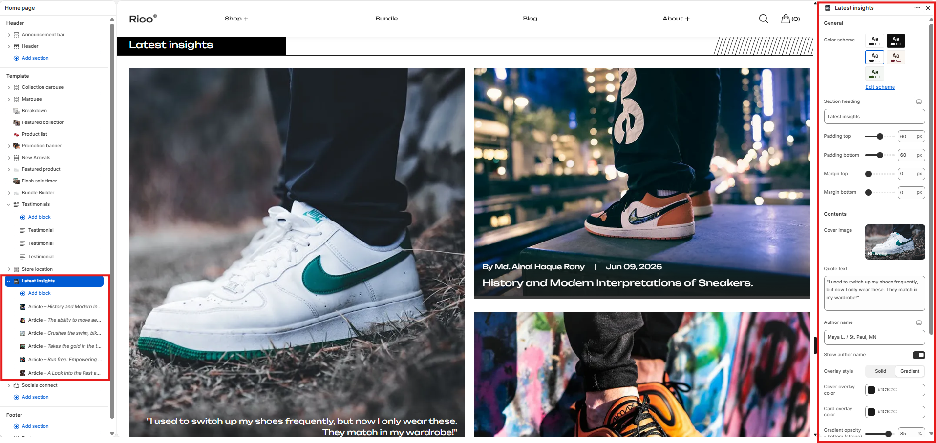
The Latest Insights section displays a horizontally scrollable article slider alongside a sticky cover image. The cover image supports an optional quote and author overlay. Each article card displays the article image, publication date, optional author name, and article title. A customizable button links customers to the full blog. The section supports up to 10 article blocks and scales responsively across all device sizes.
How to Edit the Latest Insights Section
- From your Shopify admin, go to Online Store → Themes.
- Click Customize on the active theme.
- Select the Latest Insights section from the left sidebar.
- Add Article blocks and adjust the settings according to your preferences.
- Click Save to apply your changes.
Section Settings
General
- Color Scheme: Select a color scheme applied to the section.
- Heading: Add an optional section heading displayed above the layout.
- Padding Top: Controls the top padding of the section. Scales automatically across desktop, laptop, tablet, and mobile.
- Padding Bottom: Controls the bottom padding of the section. Scales automatically across desktop, laptop, tablet, and mobile.
- Margin Top: Controls the spacing above the section. Scales automatically across desktop, laptop, tablet, and mobile.
- Margin Bottom: Controls the spacing below the section. Scales automatically across desktop, laptop, tablet, and mobile.
Content
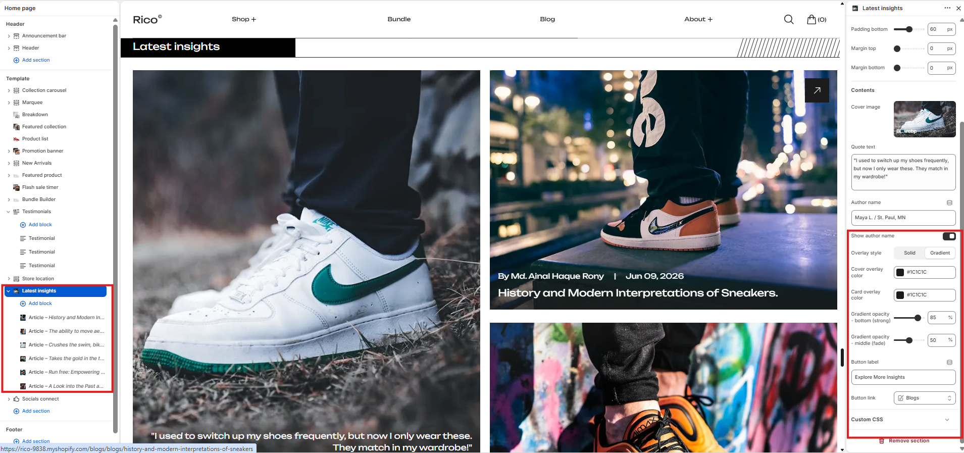
- Cover Image: Upload the sticky cover image displayed alongside the article slider.
- Quote: Add an optional quote or message displayed as an overlay on the cover image.
- Author: Enter the name of the author displayed below the quote on the cover image.
- Show Author Name: Enable or disable the display of the article author name on each article card.
- Button Text: Customize the label of the button that links to the full blog.
- Blog: Select the blog to link the button to.
Overlay Settings
- Overlay Style: Choose between Solid — flat color overlay; or Gradient — fades from solid at the bottom to transparent at the top.
- Cover Overlay Color: Sets the overlay color applied to the cover image. Default: #1C1C1C.
- Card Overlay Color: Sets the overlay color applied to each article card image. Default: #1C1C1C.
- Gradient Start Opacity: Controls the opacity at the bottom of the gradient overlay. Range: 0–100%. Default: 85%.
- Gradient End Opacity: Controls the opacity at the top of the gradient overlay. Range: 0–100%. Default: 50%.
Article Block
Add up to 10 Article blocks to populate the slider. Each block contains the following setting.
- Article: Select an article from your Shopify blog to display as a card in the slider. Each card displays the article image, publication date, optional author name, and article title. If no article is assigned, a placeholder card is displayed automatically.
Fallback Behaviour
If no cover image is uploaded, a placeholder graphic is displayed in the cover area. If an article block has no article assigned, a placeholder card with a sample date and title is displayed to maintain the layout structure during store setup.
Best Practices
Do
- Use a high-quality cover image that complements the overall section design.
- Keep the cover quote short and impactful.
- Add at least 3 article blocks to make the slider feel complete.
- Use the gradient overlay style for a more refined visual appearance.
- Link the button to the most relevant blog for your customers.
Don't
- Leave the cover image blank if a quote is configured, as the overlay will have no background to display against.
- Use excessively long quotes that overflow the cover image area.
- Add article blocks without assigning articles, as placeholder cards will be shown instead.
- Use low-resolution article images that appear blurry in the slider.
- Set the overlay opacity too high, making article titles and dates difficult to read.