Breakdown
Displays an interactive product breakdown section with a central product illustration and multiple feature cards positioned around it. As the user scrolls through the section, feature points are highlighted to explain different parts, materials, or technologies of the product. Ideal for showcasing product construction, craftsmanship, and key selling points in a visually engaging way.
Section Settings
General
- Color Scheme — Select the section color scheme.
- Padding Bottom — Controls spacing below the section.
- Title — Main heading displayed above the breakdown area.
- Before Image Title — Text displayed before the animated center image.
- After Image Title — Text displayed after the animated center image.
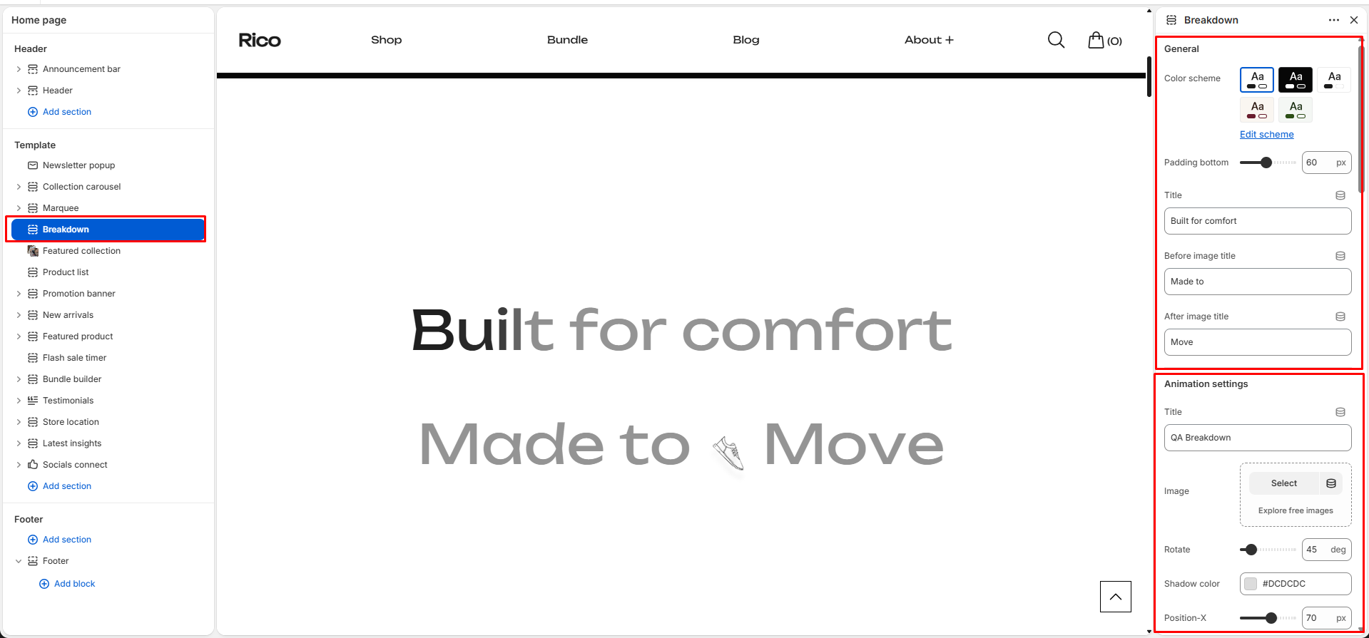
Animation Settings
Main Product Image
- Title — Internal reference label for the animation block.
- Image — Main product illustration or image displayed in the center.
- Rotate — Rotation angle applied to the product image.
- Shadow Color — Shadow color displayed behind the product image.
Desktop Position
- Position X — Horizontal position of the image on desktop devices.
- Position Y — Vertical position of the image on desktop devices.
Laptop Position
- Position X — Horizontal position of the image on laptop devices.
- Position Y — Vertical position of the image on laptop devices.
Mobile Position
- Position X — Horizontal position of the image on mobile devices.
- Position Y — Vertical position of the image on mobile devices.
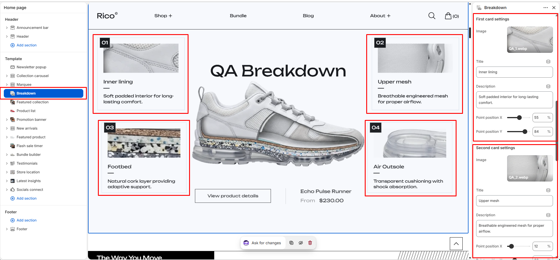
Feature Cards
The section includes four feature cards that explain different parts of the product.
First Card
- Image — Icon or small image displayed inside the card.
- Title — Feature title.
- Description — Feature explanation text.
- Point Position X — Horizontal hotspot position connected to the product image.
- Point Position Y — Vertical hotspot position connected to the product image.
Second Card
- Image — Icon or small image displayed inside the card.
- Title — Feature title.
- Description — Feature explanation text.
- Point Position X — Horizontal hotspot position connected to the product image.
- Point Position Y — Vertical hotspot position connected to the product image.
Third Card
- Image — Icon or small image displayed inside the card.
- Title — Feature title.
- Description — Feature explanation text.
- Point Position X — Horizontal hotspot position connected to the product image.
- Point Position Y — Vertical hotspot position connected to the product image.
Fourth Card
- Image — Icon or small image displayed inside the card.
- Title — Feature title.
- Description — Feature explanation text.
- Point Position X — Horizontal hotspot position connected to the product image.
- Point Position Y — Vertical hotspot position connected to the product image.
Button Settings
- Select Product — Choose the product linked to the call-to-action button.
- Button Name — Custom text displayed on the button.
- Type — Choose between Primary or Secondary button style.
- Animation — Select button animation style. Available options include Default and Letter Slide.
Special Features
- Scroll-based product storytelling.
- Interactive product breakdown visualization.
- Four configurable feature cards.
- Product hotspots connected to specific product areas.
- Rotating product image animation.
- Custom image positioning for Desktop, Laptop, and Mobile devices.
- Product-linked call-to-action button.
- Fully responsive layout.
- Keyboard accessible navigation.
- Optimized for footwear, apparel, accessories, and technical products.
Best Practices
Do
- Use a transparent PNG or SVG product illustration for the best visual effect.
- Add a short and clear section title.
- Keep feature descriptions concise and easy to read.
- Use meaningful feature titles such as Inner Lining, Upper Mesh, Footbed, or Air Outsole.
- Configure all four feature cards with unique product benefits.
- Adjust hotspot positions so they align with the correct product areas, and test them on all device sizes.
- Fine-tune image position settings for desktop, laptop, and mobile layouts.
- Use consistent icons across all feature cards.
- Link the CTA button to the featured product page for quick purchasing.
Don't
- Upload low-resolution images — they will appear blurry against the large central display area.
- Use long paragraphs inside card descriptions — keep each description to one or two short sentences.
- Place hotspot points outside the product image area — they will appear disconnected and confuse customers.
- Use excessive image rotation values that make the product difficult to view or identify.
- Leave feature cards empty — placeholder cards will appear in your live store and look unfinished.
- Use this section for products that do not benefit from visual feature explanations — it works best for footwear, apparel, accessories, and technical products with distinct components.