Product List
Display products in a clean responsive product grid sourced from a collection or a manually curated list, with horizontal mobile scrolling and flexible load controls.
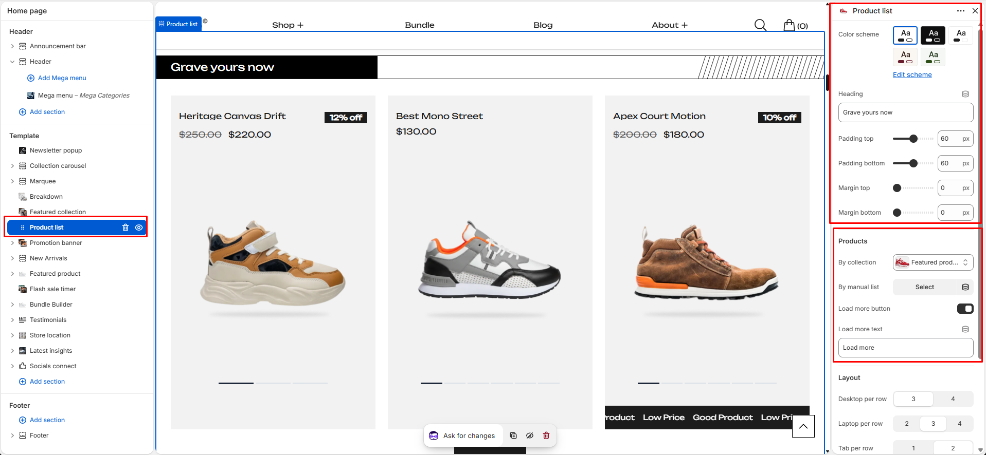
The Product List section displays products in a clean responsive grid. Products can be sourced either from a selected collection or from a manually curated product list. The section supports horizontal scrolling on mobile, an optional custom scrollbar, and either a "Load More" button or a "View All" collection link.
Section Settings
General
- Color Scheme: Choose the color scheme used for the entire section.
- Heading: Main section heading displayed above the product grid.
- Padding Top: Controls the space above the section.
- Padding Bottom: Controls the space below the section.
- Margin Top: Controls the external spacing above the section.
- Margin Bottom: Controls the external spacing below the section.
Products
- Collection: Select a collection to automatically display products from that collection.
- Manual Product List: Manually select up to 8 products to display. If both a collection and manual product list are configured, the theme's implementation determines which source is used.
- Enable Load More: Shows a "Load More" button below the product grid.
- Load More Button Text: Customize the label shown on the Load More button.
- Enable View All: Shows a button linking to the selected collection page. Only available when a collection is selected and Load More is disabled.
- View All Button Text: Customize the label shown on the View All button.
Layout
- Desktop Columns: Choose how many products appear per row on desktop. Options: 3 Columns, 4 Columns.
- Laptop Columns: Choose how many products appear per row on laptop. Options: 2 Columns, 3 Columns, 4 Columns.
- Tablet Columns: Choose how many products appear per row on tablet. Options: 1 Column, 2 Columns.
- Grid Gap: Controls the spacing between product cards.
Special Features
- Responsive Layout: Automatically adapts the number of visible products based on screen size.
- Mobile Horizontal Scrolling: Products become horizontally scrollable on mobile devices for a smoother browsing experience.
- Custom Scrollbar: Displays a synchronized custom scrollbar for horizontal product navigation.
- Collection-Based Products: Automatically pulls products from a selected collection.
- Manual Product Selection: Allows merchants to curate and display specific products.
- Load More Functionality: Progressively reveals additional products without navigating away from the page.
- View All Collection Link: Directs customers to the full collection page.
- Empty State Placeholders: Displays placeholder product cards when no products are available.
- Theme Product Card Integration: Uses the shared product card component to maintain consistent styling across the theme.
Best Practices
Do
- Use a collection when products should update automatically.
- Use the manual product list when showcasing specific products.
- Keep product counts balanced with the selected column layout.
- Use clear and action-oriented button text.
- Test the section on mobile and desktop devices.
Don't
- Enable both Load More and View All for the same use case.
- Leave the section without products if it is intended to be visible to customers.
- Use extremely large grid gaps that create excessive whitespace.
- Select more products than necessary for the intended layout.
- Use misleading button labels that do not match their destination or action.