Hero Banner
Display a full-width promotional banner with separate desktop and mobile media support, overlaid text content, and flexible layout controls.
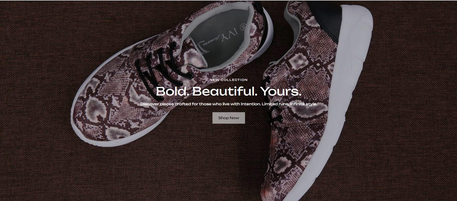
The Hero Banner is a full-width media section designed for high-impact promotional experiences. It supports both image and video backgrounds with independent desktop and mobile media controls across all video types — Shopify-hosted, external YouTube or Vimeo, and direct MP4 URLs. An optional color overlay improves text readability, and the overlaid content area supports a subheading, heading, description, and call-to-action button with independent desktop and mobile alignment controls.
How to Edit the Hero Banner Section
- From your Shopify admin, go to Online Store → Themes.
- Click Customize on the active theme.
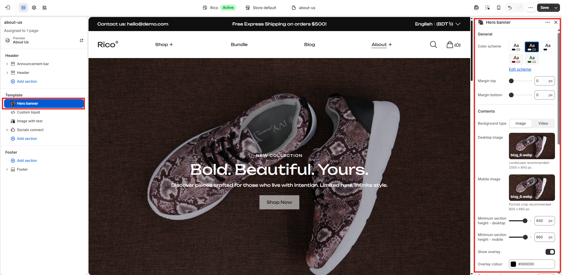
- Select the Hero Banner section from the left sidebar.
- Adjust the settings according to your preferences.
- Click Save to apply your changes.
Section Settings
General
- Color Scheme: Select a color scheme applied to the section.
- Margin Top: Controls the spacing above the section. Scales automatically across desktop, laptop, tablet, and mobile.
- Margin Bottom: Controls the spacing below the section. Scales automatically across desktop, laptop, tablet, and mobile.
Media
- Media Type: Choose between Image or Video as the background media.
- Desktop Image: Upload the image displayed on desktop devices. Recommended width: 2000px. Only available when Media Type is set to Image.
- Mobile Image: Upload a separate image optimized for mobile devices. If left blank, the desktop image is used as a fallback. Only available when Media Type is set to Image.
- Video Type: Select the video source type. Options: Shopify — upload videos directly via Shopify; External — link to YouTube or Vimeo URLs; Direct — enter direct MP4 URLs. Only available when Media Type is set to Video.
- Desktop Video (Shopify): Upload the desktop video via Shopify. Only available when Video Type is set to Shopify.
- Mobile Video (Shopify): Upload a separate mobile video via Shopify. If left blank, the desktop video is used as a fallback. Only available when Video Type is set to Shopify.
- External Video URL (Desktop): Enter a YouTube or Vimeo URL for desktop. Supports standard URLs, short URLs, and YouTube Shorts. Only available when Video Type is set to External.
- External Video URL (Mobile): Enter a separate YouTube or Vimeo URL for mobile. If left blank, the desktop URL is used as a fallback. Only available when Video Type is set to External.
- Direct Video URL (Desktop): Enter a direct MP4 video URL for desktop. Only available when Video Type is set to Direct.
- Direct Video URL (Mobile): Enter a separate direct MP4 URL for mobile. If left blank, the desktop URL is used as a fallback. Only available when Video Type is set to Direct.
- Section Height (Desktop): Set the minimum height of the section on desktop. Range: 300–1020px. Default: 840px.
- Section Height (Mobile): Set the minimum height of the section on mobile. Range: 200–800px. Default: 660px.
- Show Overlay: Enable or disable a color overlay applied on top of the background media.
- Overlay Color: Sets the color of the overlay. Default: #000000. Only available when Show Overlay is enabled.
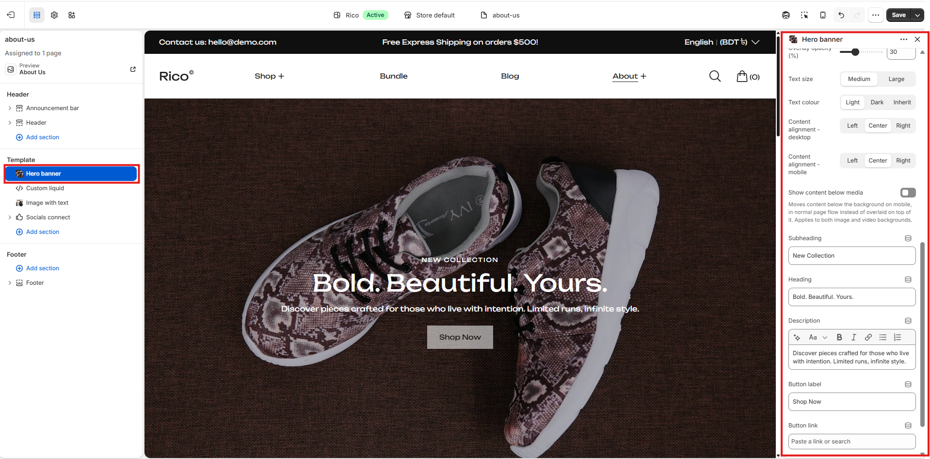
- Overlay Opacity: Controls the transparency of the overlay. Range: 0–90%. Default: 30%. Only available when Show Overlay is enabled.
Content Settings
Layout
- Text Size: Controls the size of the heading and body text. Options: Medium; Large.
- Text Color: Sets the color of the overlaid text content. Options: Light — white text; Dark — dark text; Inherit — uses the active color scheme text color.
- Content Alignment (Desktop): Controls the horizontal alignment of the content block on desktop. Options: Left, Center, Right.
- Content Alignment (Mobile): Controls the horizontal alignment of the content block on mobile. Options: Left, Center, Right.
- Move Content Below Media on Mobile: When enabled, the text content is displayed below the background media on mobile instead of overlaid on top of it.
Content
- Subheading: Enter an optional subheading displayed above the main heading.
- Heading: Enter the main heading displayed over the background media.
- Description: Add an optional rich text description displayed below the heading.
- Button Label: Enter the text for the call-to-action button.
- Button Link: Assign a destination URL for the call-to-action button.
Fallback Behaviour
If no desktop or mobile image is uploaded, a placeholder graphic is displayed automatically. For video types, if no mobile video or URL is provided, the desktop video is used as a fallback across all device sizes. If no video is configured at all, a default placeholder video is displayed to maintain the section layout during store setup.
Best Practices
Do
- Use high-resolution images for crisp display across all screen sizes.
- Upload separate mobile images and videos optimized for portrait viewports.
- Use a subtle overlay to improve text readability over busy backgrounds.
- Keep the heading short and impactful for immediate customer engagement.
- Use Shopify-hosted videos for the best performance and compatibility.
- Use YouTube Shorts URLs for mobile external videos to better suit portrait screen ratios.
Don't
- Use low-resolution images that appear blurry on large screens.
- Set overlay opacity too high, which may obscure the background media entirely.
- Use excessively long headings or descriptions that overflow the banner area.
- Link external videos from unsupported platforms other than YouTube or Vimeo.
- Disable the overlay when using light-colored backgrounds with light text, as content may become unreadable.