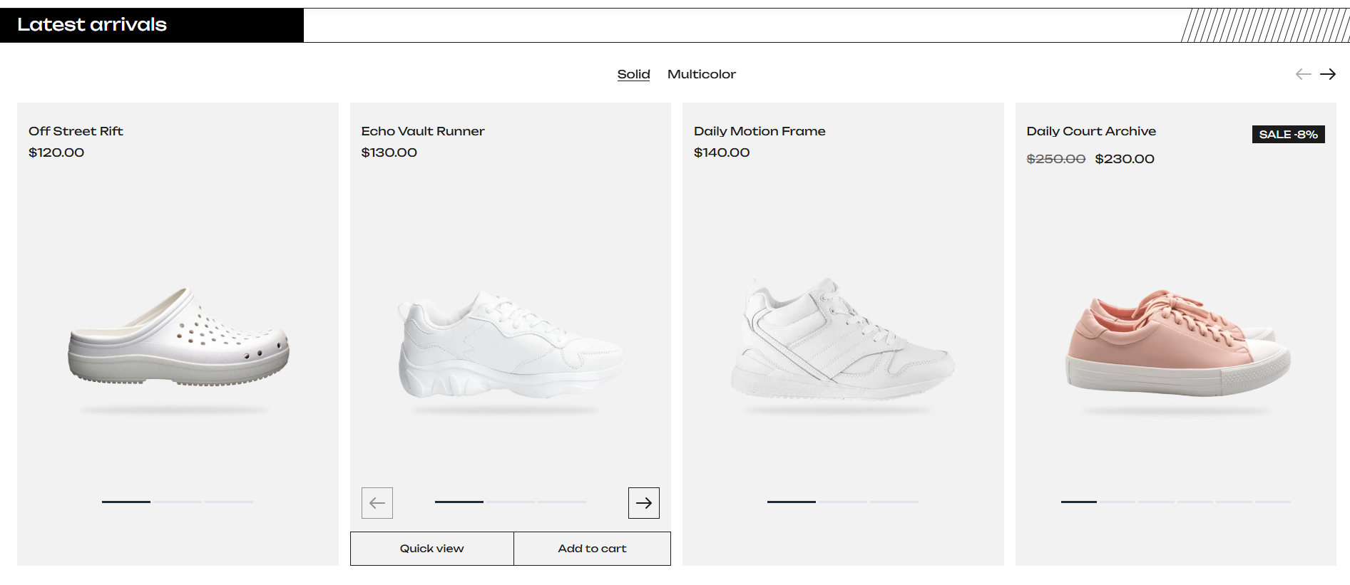
New Arrivals
Display newly arrived products in a tabbed product slider. Each tab showcases products from a different collection so customers can browse the latest arrivals by category.
The New Arrivals section displays newly arrived products in a tabbed product slider. Each tab can showcase products from a different collection, allowing customers to browse the latest arrivals by category.
Section Settings
General
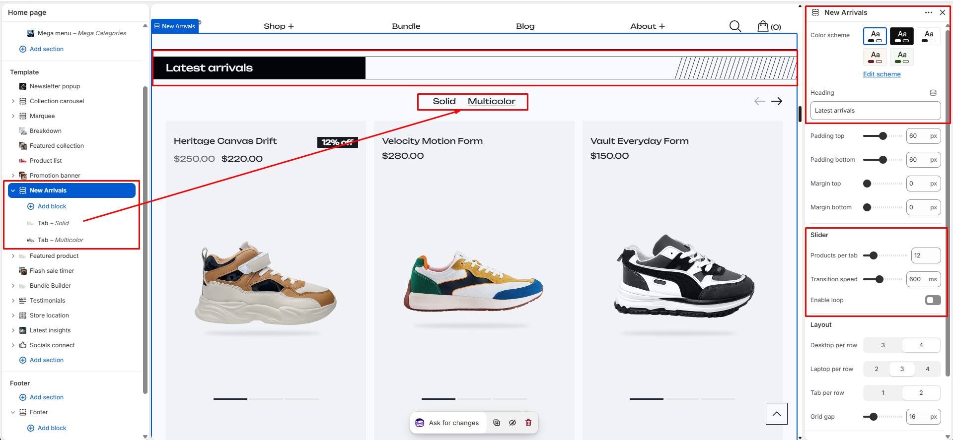
- Color Scheme: Choose the color scheme for the section to match your store's branding.
- Heading: Main section heading displayed above the product tabs. Examples: New Arrivals, Latest Drops, Just Landed.
- Padding Top: Controls spacing above the section.
- Padding Bottom: Controls spacing below the section.
- Margin Top: Controls outer spacing above the section.
- Margin Bottom: Controls outer spacing below the section.
Slider Settings
- Products Per Tab: Choose how many products to display from each selected collection. Range: 4–50 products.
- Transition Speed: Controls the slide animation speed. Range: 200ms–1200ms.
- Enable Loop: When enabled, the slider continuously loops through products.
Product Grid Layout
- Desktop Columns: Choose how many products are visible per row on large desktop screens. Options: 3 Columns, 4 Columns.
- Laptop Columns: Choose how many products are visible on laptop screens. Options: 2 Columns, 3 Columns, 4 Columns.
- Tablet Columns: Choose how many products are visible on tablet devices. Options: 1 Column, 2 Columns.
- Grid Gap: Controls spacing between product cards. Range: 0px–80px.
Tab Blocks
Add one or more Tab blocks to create separate product groups. Each tab has its own title and collection.
- Tab Title: Custom title displayed in the tab navigation. Examples: Men, Women, Sneakers, Accessories, New Season.
- Collection: Select the collection whose products will be displayed inside the tab. Products are automatically pulled from the selected collection.
Special Features
- Collection-based product tabs
- Multiple tab support
- Swiper-powered product slider with previous/next navigation controls
- Responsive product grid
- Keyboard-accessible tab navigation
- Mobile optimized layout
- Adjustable slider speed and optional infinite loop mode
- Automatic placeholder products when no collection is selected
- Supports Shopify App Blocks
Best Practices
Do
- Create meaningful tab names that help customers understand product categories.
- Use collections that are regularly updated with new products.
- Keep the number of tabs reasonable for better usability.
- Use consistent product imagery across collections.
- Enable loop mode for larger product collections.
- Test column settings across desktop, tablet, and mobile devices.
Don't
- Create tabs without assigning a collection.
- Use very long tab titles that may wrap onto multiple lines.
- Add too many tabs, as navigation may become difficult on smaller screens.
- Set an excessively high product count if collection sizes are small.
- Use duplicate collections across multiple tabs unless intentionally required.
- Enable loop mode when only a few products are available, as it may create a repetitive browsing experience.