Rich Text
Display a flexible block of text content with optional subheading, heading, description, and call-to-action button.
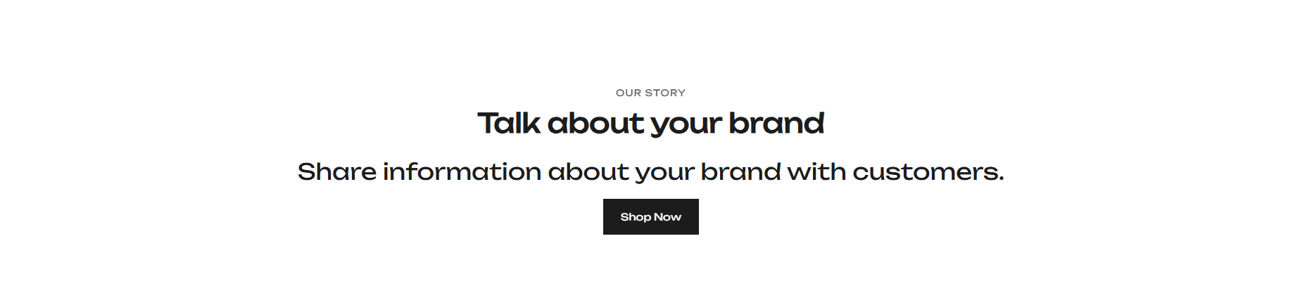
The Rich Text section provides a simple and flexible content block for displaying promotional copy, brand messaging, editorial content, or any other text-based information. It is block-based, allowing merchants to combine a subheading, heading, body text, and button in any configuration. Content alignment can be set to left, center, or right to suit the surrounding page layout.
How to Edit the Rich Text Section
- From your Shopify admin, go to Online Store → Themes.
- Click Customize on the active theme.
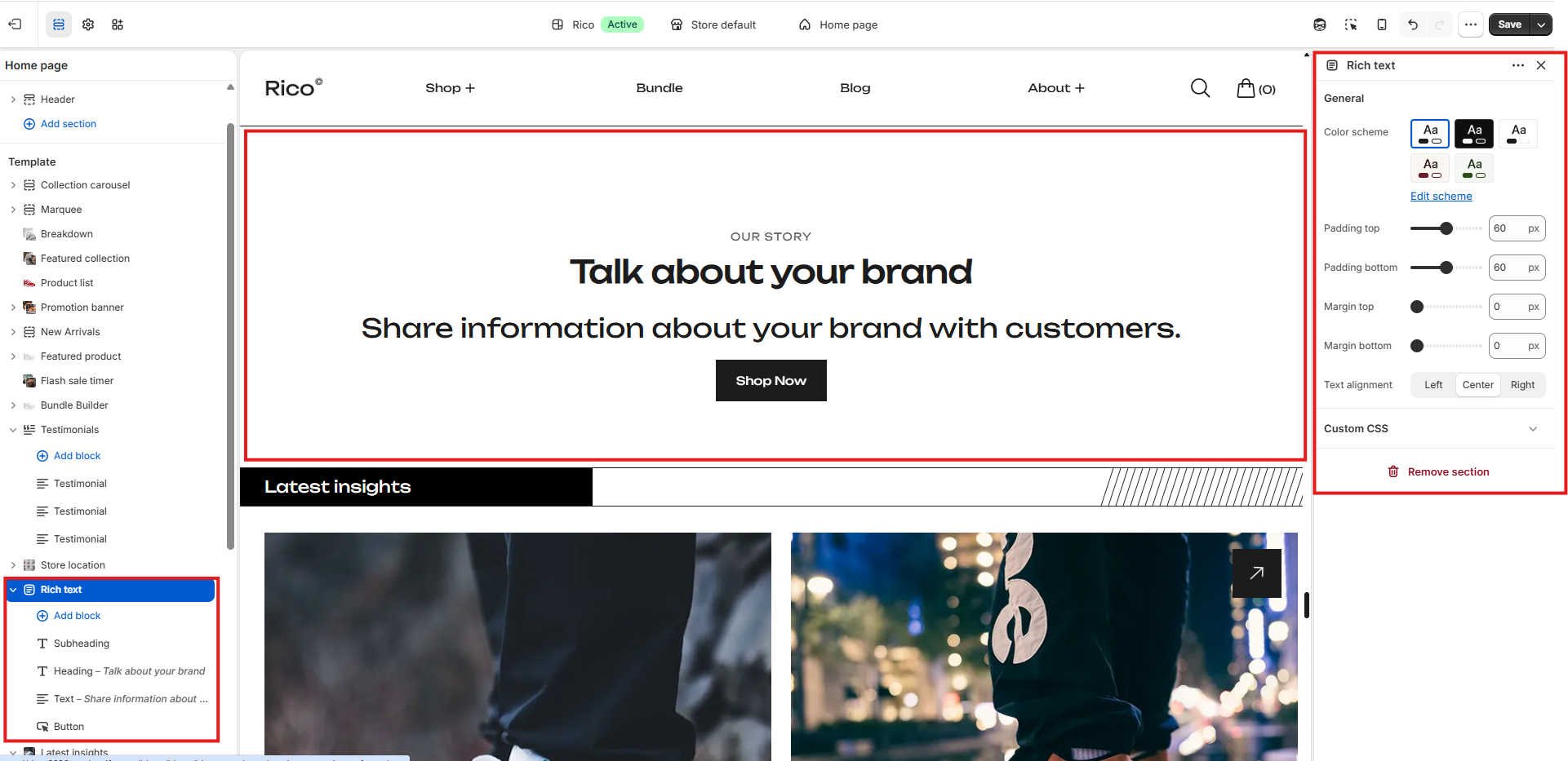
- Select the Rich Text section from the left sidebar.
- Add blocks and adjust the settings according to your preferences.
- Click Save to apply your changes.
Section Settings
General
- Color Scheme: Select a color scheme applied to the section.
- Padding Top: Controls the top padding of the section. Scales automatically across desktop, laptop, tablet, and mobile.
- Padding Bottom: Controls the bottom padding of the section. Scales automatically across desktop, laptop, tablet, and mobile.
- Margin Top: Controls the spacing above the section. Scales automatically across desktop, laptop, tablet, and mobile.
- Margin Bottom: Controls the spacing below the section. Scales automatically across desktop, laptop, tablet, and mobile.
- Content Alignment: Controls the horizontal alignment of all content within the section. Options: Left, Center, Right. Default: Center.
Blocks
The Rich Text section is built using blocks. Each block type can be added once and arranged in any order.
Subheading Block
- Subheading: Enter a short subheading displayed above the main heading. Rendered in uppercase with subtle letter spacing.
Heading Block
- Heading: Enter the main heading text.
- Heading Size: Select the heading level. Options: H1 — 48px; H2 — 38px; H3 — 30px. Default: H2.
Text Block
- Text: Add rich text body content supporting formatting such as bold, italic, lists, and links.
Button Block
- Button Label: Enter the text for the call-to-action button.
- Button Link: Assign a destination URL for the button.
Best Practices
Do
- Keep headings concise and relevant to the surrounding page content.
- Use the subheading to provide brief context above the main heading.
- Use center alignment for standalone promotional or editorial sections.
- Use left alignment when the section sits alongside other content columns.
- Link the button to a relevant collection, page, or campaign destination.
Don't
- Add excessive body text that makes the section feel overwhelming.
- Use H1 heading size unless the section is the primary heading of the page.
- Leave the button block without a destination URL.
- Use all four blocks when only a subset is needed — add only what serves the content.
- Use right alignment for primary content sections as it reduces readability.