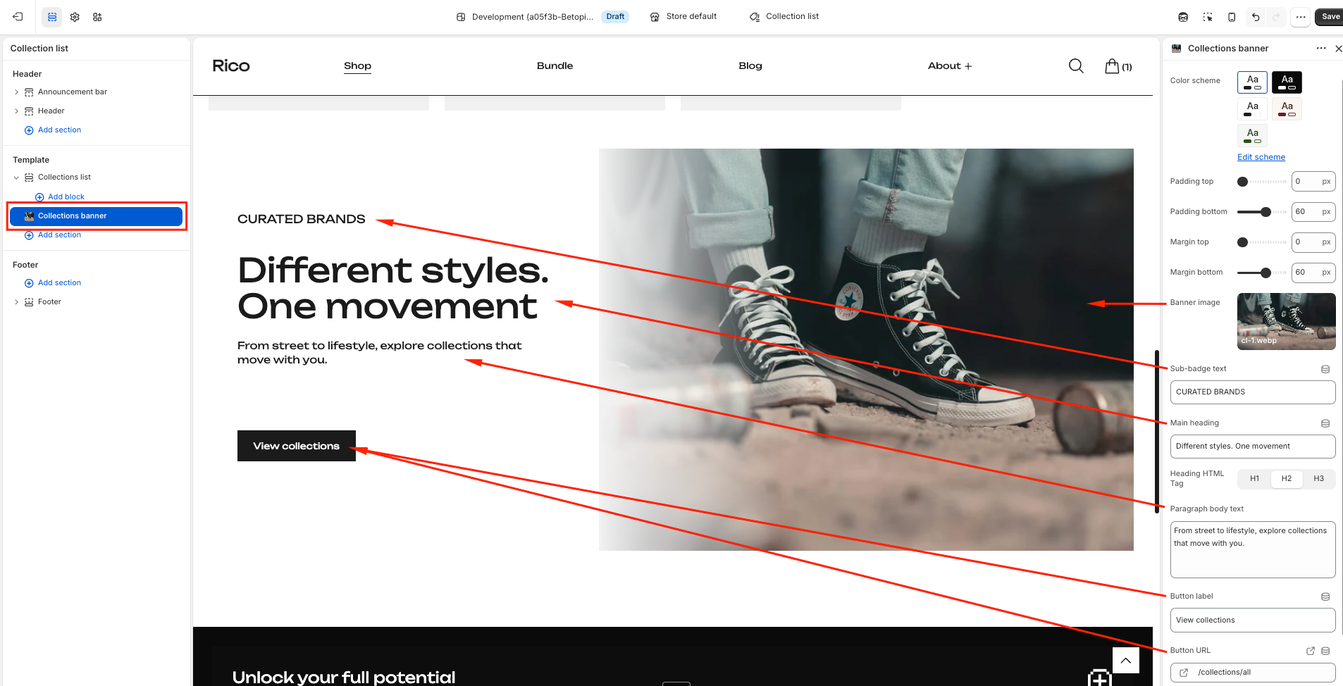
Collections Banner
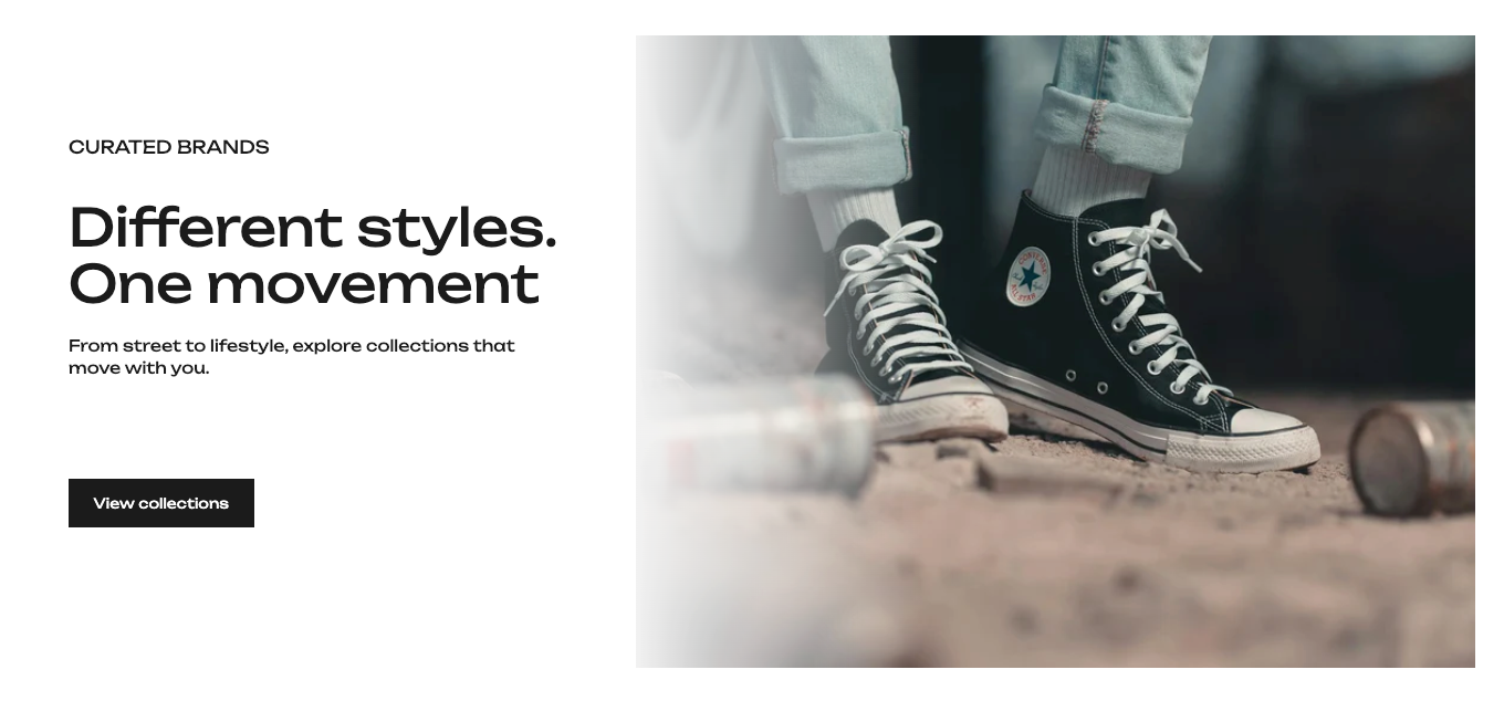
The Collections Banner is a full-width two-column section designed to make a strong visual statement about your store or a specific category. The left side holds your text content and a call-to-action button. The right side holds a large image. It works well on collection list pages, landing pages, or anywhere you want to give customers a compelling reason to explore your store.
Section Settings
- Color Scheme — Sets the background and text colors for the section. Pick a scheme that works with the image you are using and the surrounding sections.
- Padding Top / Padding Bottom — Controls the space inside the section above and below the content.
- Margin Top / Margin Bottom — Controls the space outside the section, separating it from the sections above and below it on the page.
Image
- Banner Image — The large image that fills the right half of the section. Use a high-quality lifestyle or product photo that represents what you want customers to explore. If you leave this empty, a placeholder graphic appears so the layout stays intact in the editor.
Content
- Sub-badge Text — A small line of uppercase text shown above the main heading. Use it as a category label or a short descriptor — for example "Curated Brands" or "New Arrivals". This field is optional; if you leave it blank it simply does not appear.
- Main Heading — The large headline on the left side of the section. This is the most prominent piece of text so make it count — something short and punchy works best, like "Different styles. One movement" or "Built for every run".
- Heading HTML Tag — Controls whether the heading is treated as an H1, H2, or H3 by the page. This is mainly relevant for SEO. If this is the main heading on the page, use H1. If there is already a page title above it, use H2. Leave it at H2 if you are not sure.
- Paragraph Body Text — A short supporting paragraph below the main heading. Use this to add a little more context or personality — for example "From street to lifestyle, explore collections that move with you." Keep it to one or two sentences.
- Button Label — The text on the call-to-action button. The default is "View collections". Change it to match where the button links — for example "Shop now", "Explore all", or "Browse the range".
- Button URL — Where the button takes customers. By default it links to your all-products collection. You can point it to any page, collection, or external URL.
The button only appears on the page if both the Button Label and the Button URL are filled in. If either is left blank, the button will not show.
Best Practices
Do
- Choose a banner image that has strong visual contrast with the text on the left. Since the text sits on a separate background panel, the image does not need a dark overlay — but make sure it looks good next to the content color scheme you have chosen.
- Keep the Main Heading short. Two to four words across two lines looks the most impactful.
- Use the Sub-badge Text to give customers immediate context — tell them what category or brand story they are about to explore.
- Link the button to something specific rather than the homepage. A collection page or a curated landing page converts better than a generic destination.
Don't
- Leave the Button Label filled in but the Button URL empty — the button will not appear and customers have no way to act on the section.
- Write a long paragraph in the Body Text field — this section is designed for a short punchy message, not detailed descriptions. Keep it to two sentences at most.
- Use a very light or washed-out image — the right column is large and a low-contrast image will make the whole section feel flat.