Product Page
Display detailed product information with a fully configurable block-based layout — add, remove, and reorder content blocks to build the ideal product page experience.
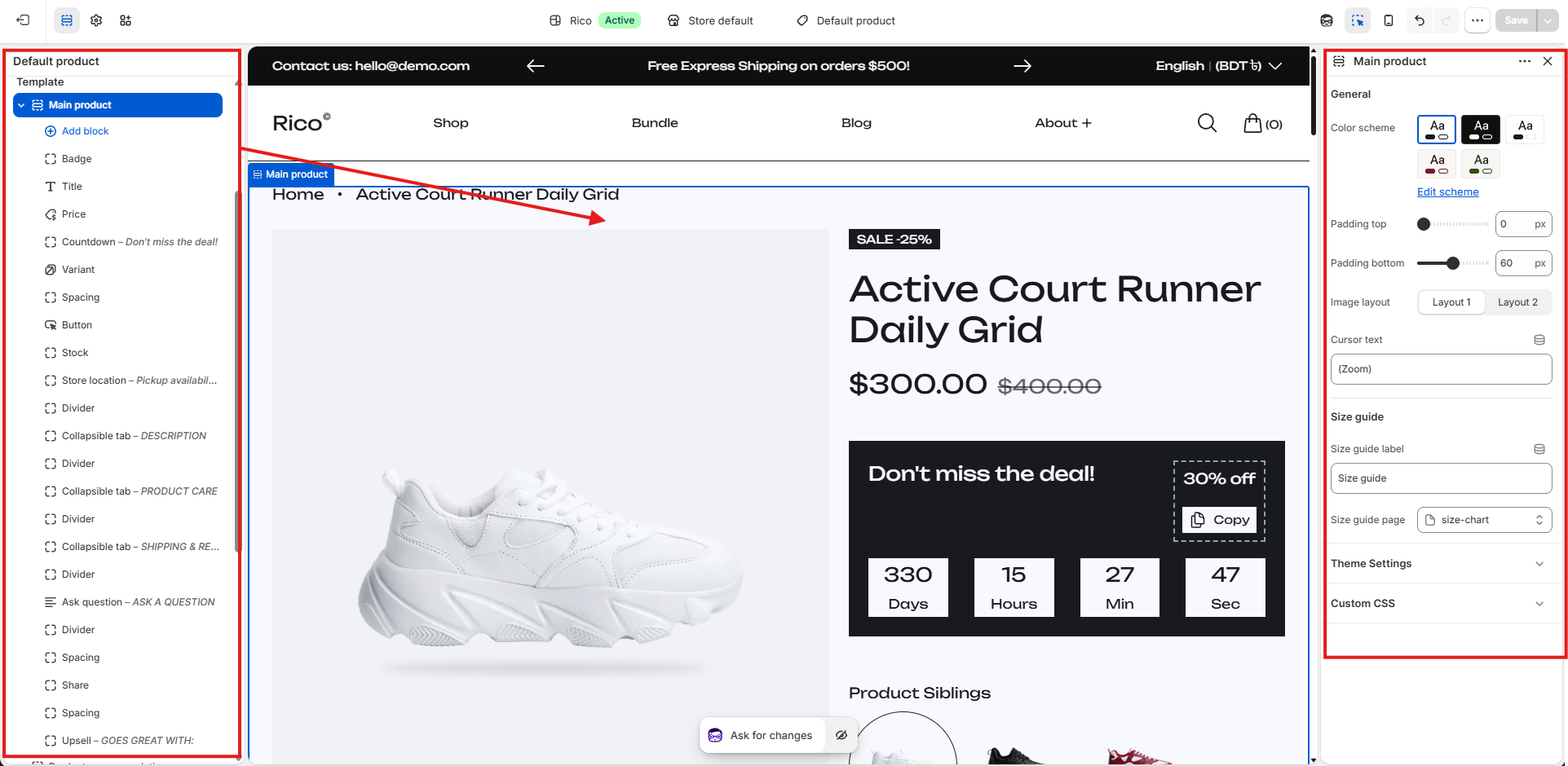
The Product section displays detailed product information and allows merchants to customize the product page layout using configurable blocks.
Adding Blocks
- Open the Theme Editor.
- Select the Product page.
- Click Add block.
- Select the desired block type from the available options.
- Configure the block settings from the right sidebar.
- Drag and drop blocks to reorder them within the section.
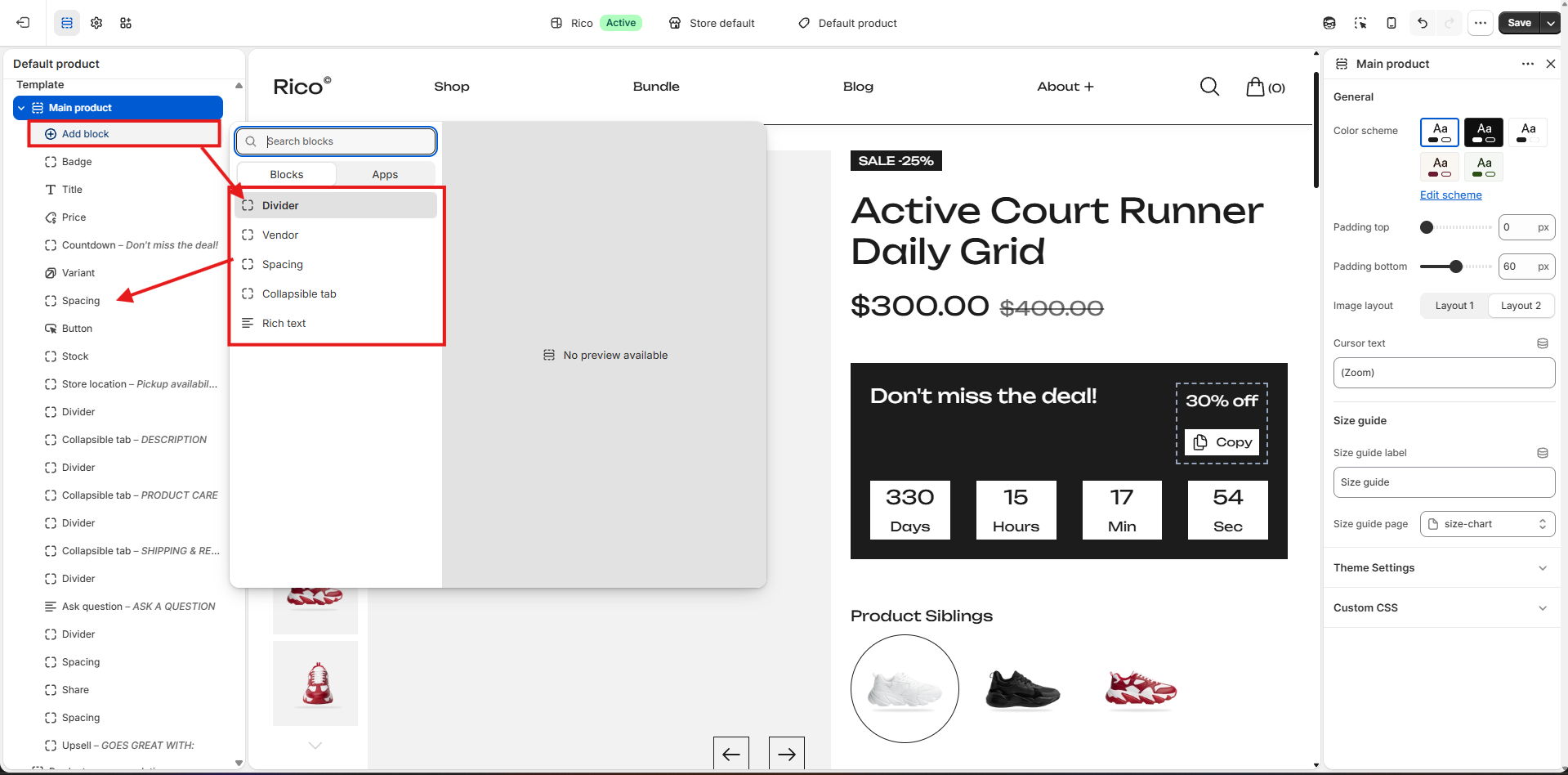
Available blocks include: Badge, Rich Text, Title, Vendor, Spacing, Price, Countdown Timer, Variant Selector, Button, Stock Information, Store Location, Divider, Collapsible Tab, Ask a Question, Share, and Upsell Products.
Section Settings
- Color Scheme: Choose a predefined color style for the section. Includes multiple theme color presets (light/dark variants). Click Edit scheme to customize colors.
- Padding Top / Padding Bottom: Controls space above and below the section.
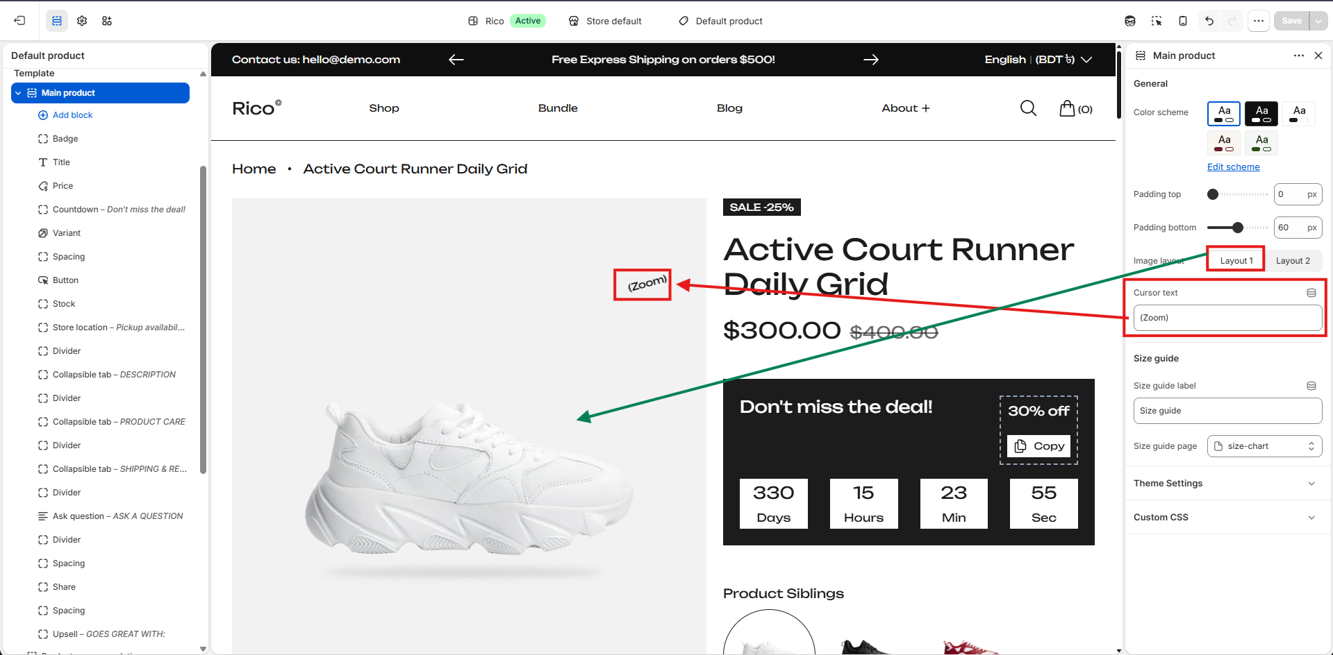
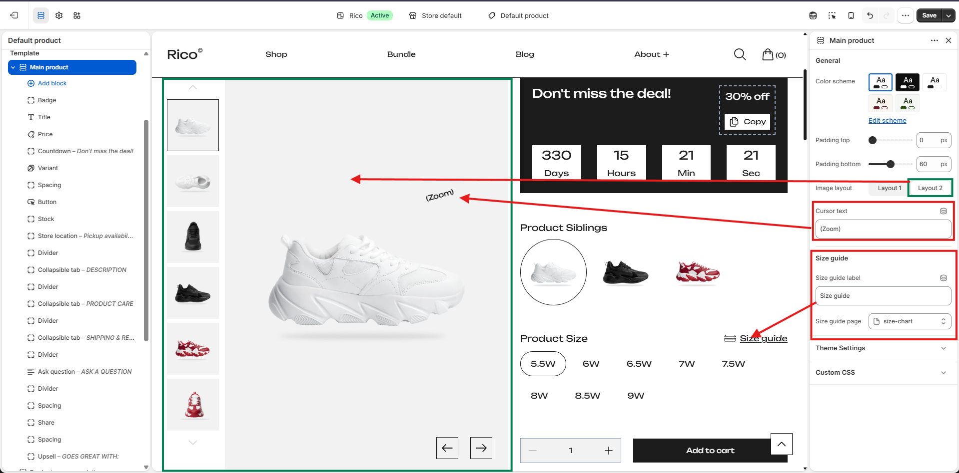
- Image Layout: Controls how product images are displayed. Layout 1 — default layout. Layout 2 — alternative visual arrangement suited for modern or product-focused designs.
- Heading: Displays a custom heading above the Product section. Default: Product.
- Cursor Text: Customize the text displayed when customers hover over the product image.
- Size Guide: Display a size guide link alongside product options.
- Size Guide Label: Customize the text shown to customers. Default: Size guide.
- Size Guide Page: Select a page that contains size guide information.
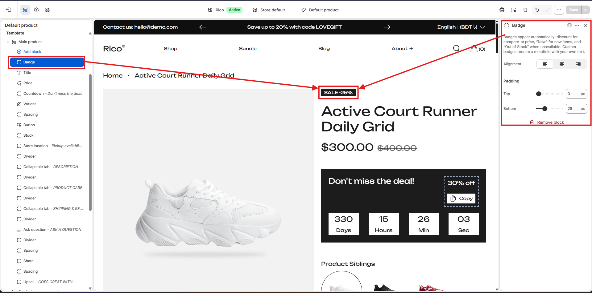
Badge Block
Displays promotional or status badges above the product title. Supports automatic badges (Sale Percentage, New, Out of Stock) and custom badges created using metafields.
- Alignment: Text alignment options: Left, Center, Right.
- Padding Top: Controls spacing above the badge.
- Padding Bottom: Controls spacing below the badge.
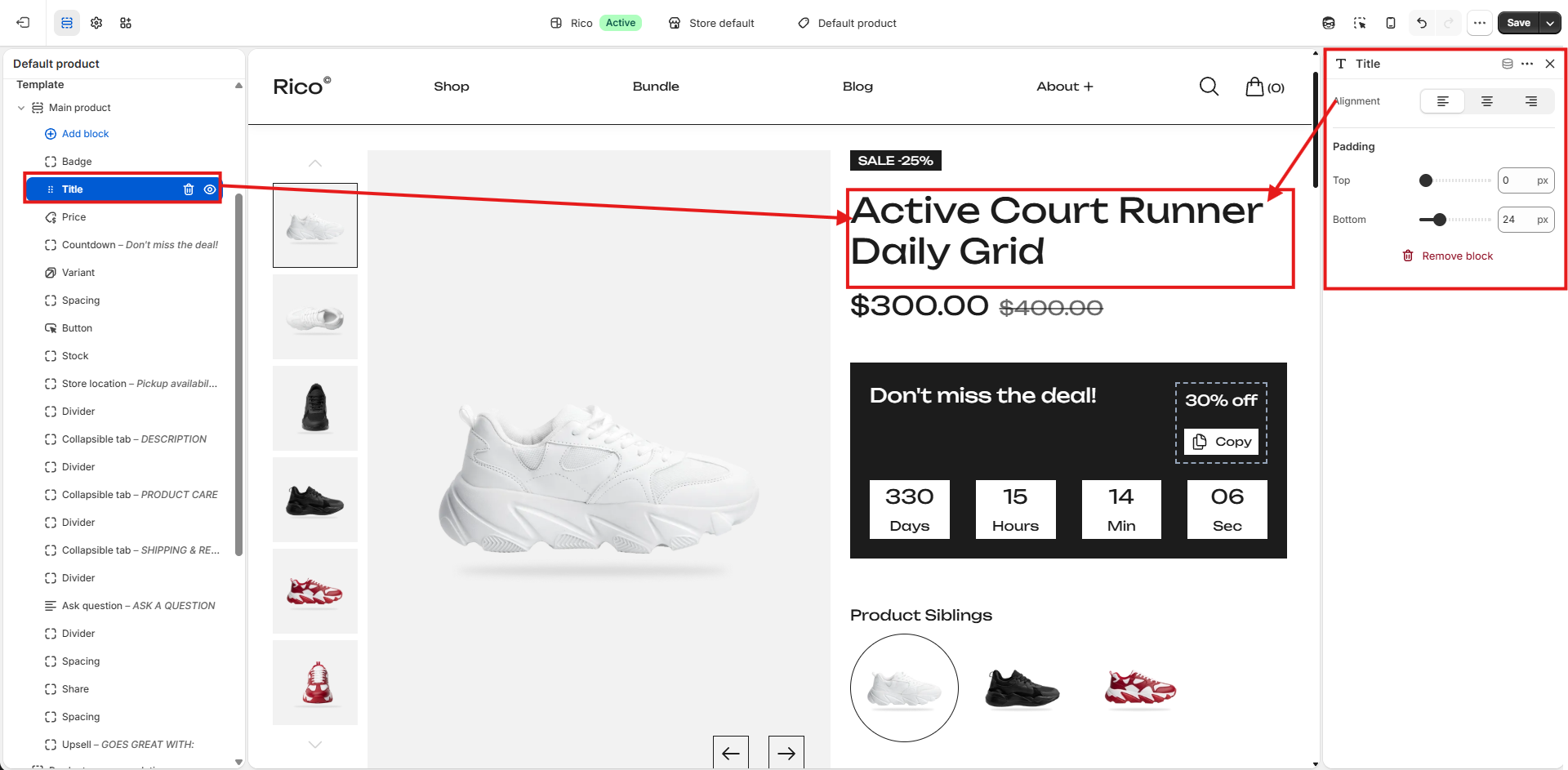
Title Block
Displays the product title, automatically pulled from the product information.
- Alignment: Controls the horizontal alignment of the product title. Options: Left, Center, Right.
- Padding Top: Adds space above the title.
- Padding Bottom: Adds space below the title.
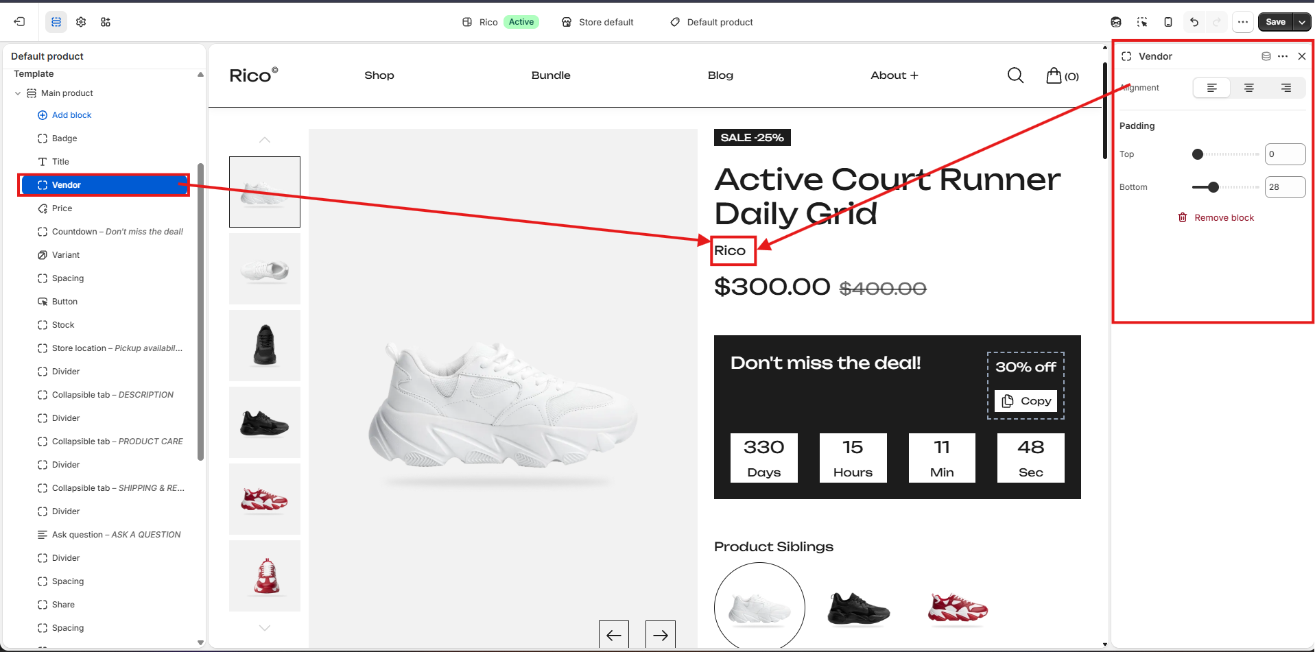
Vendor Block
Displays the product brand or vendor name.
- Alignment: Controls the horizontal alignment of the vendor name. Options: Left, Center, Right.
- Padding Top: Adds space above the vendor block.
- Padding Bottom: Adds space below the vendor block.
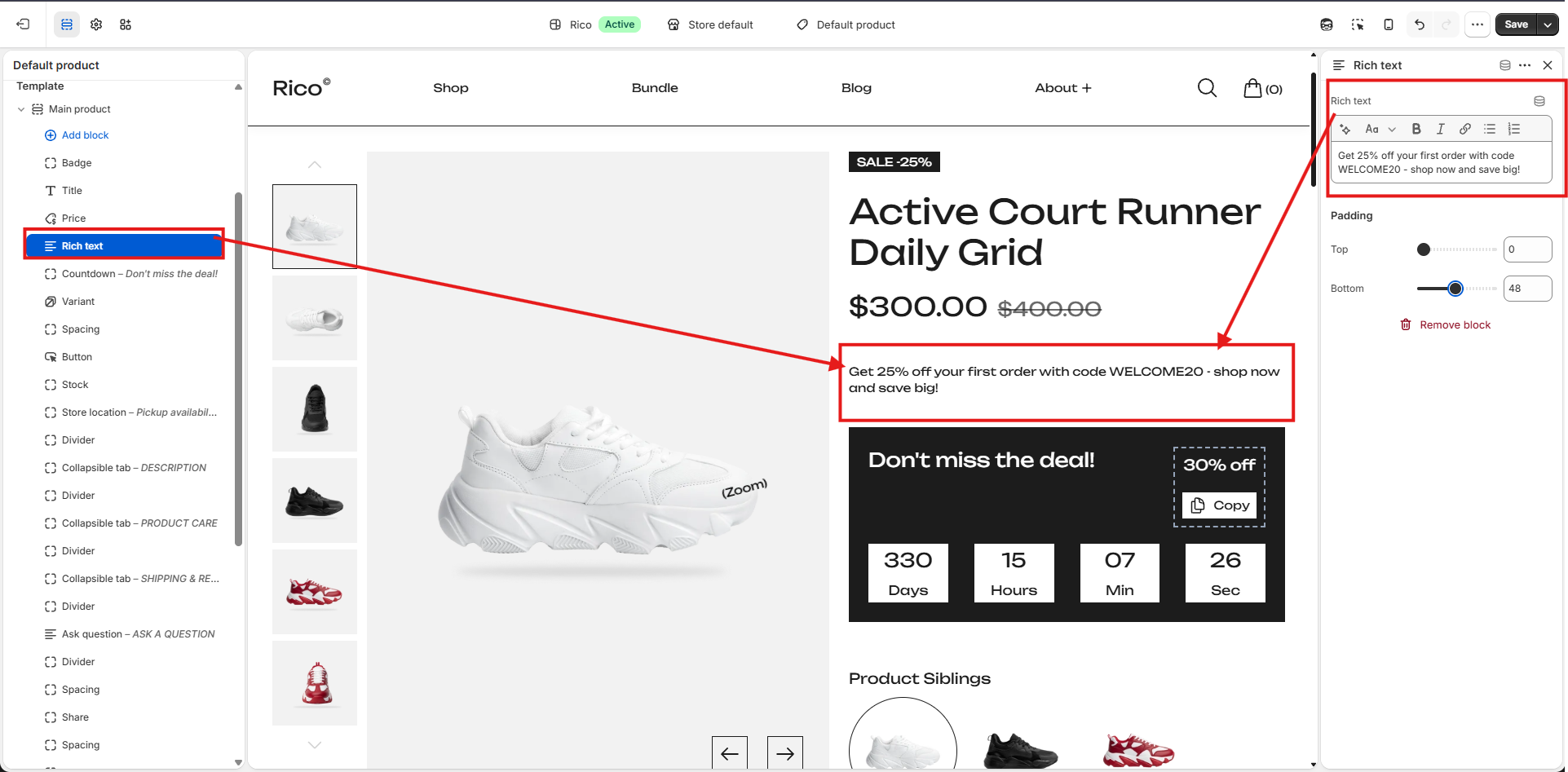
Rich Text Block
Displays custom text, promotional messages, product highlights, or additional information anywhere within the Product section.
- Rich Text Content: Add formatted text using the built-in editor. Supports headings, bold, italic, links, and ordered/unordered lists.
- Padding Top: Adds space above the rich text block.
- Padding Bottom: Adds space below the rich text block.
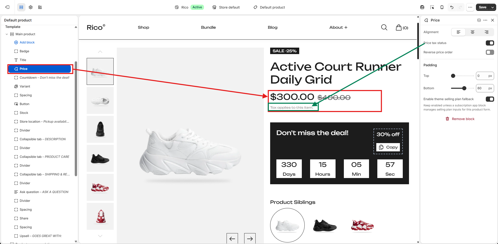
Price Block
Displays product pricing information including sale price and regular price, allowing customers to clearly see pricing and savings.
- Alignment: Controls the horizontal alignment of the price. Options: Left, Center, Right.
- Reverse Price Order: Enable or disable to swap the display order of sale and regular prices.
- Enable Theme Selling Plan Fallback: Keep enabled unless a subscription app block manages selling plan inputs for this product form.
- Padding Top: Adds space above the price block.
- Padding Bottom: Adds space below the price block.
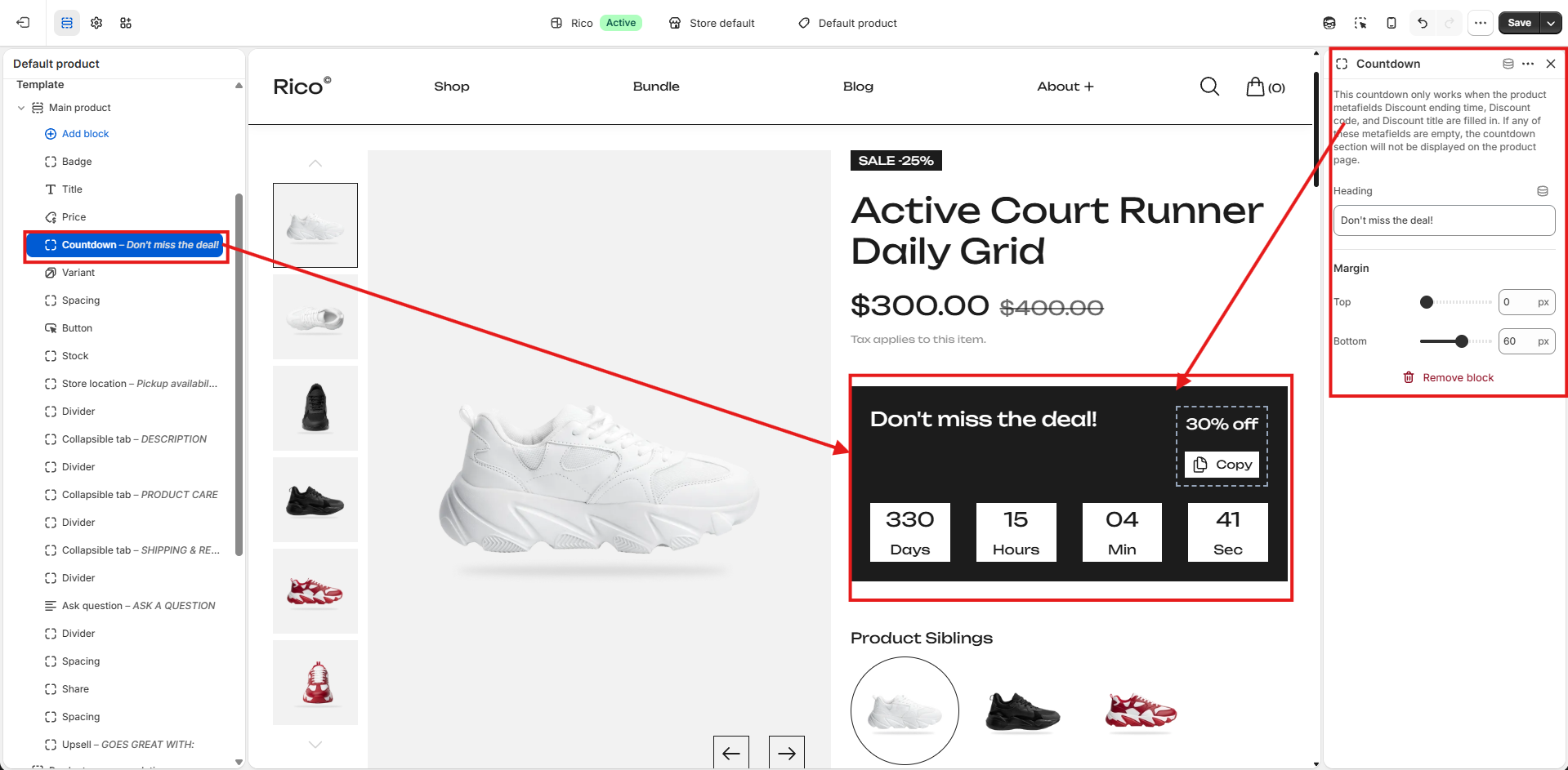
Countdown Block
Displays a promotional countdown timer on the product page to highlight limited-time offers and discounts.
Requirements
- The countdown timer will only appear when the following product metafields are completed: Discount ending time, Discount code, and Discount title. If any of these metafields are empty, the countdown block will not be displayed.
- When a Discount code is provided, a Copy button is displayed so customers can quickly copy the code.
Setup Instructions
- Create a discount in your store admin for the product you want to promote.
- Open the product and fill in the following metafields: Discount ending time, Discount code, and Discount title.
- Add the Countdown Block to the product template in the theme editor.
- Save your changes.
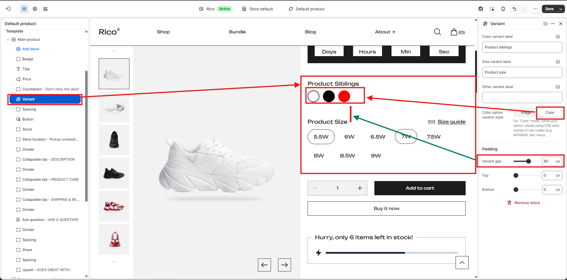
Variant Block
Allows customers to select product variants such as Color, Size, and other product options directly from the Product section.
- Color Variant Label: Customize the label displayed above the color variant selector. Default: Product Siblings.
- Size Variant Label: Customize the label displayed above the size selector. Default: Product Size.
- Other Variant Label: Customize the label for an additional product option such as Material or Style.
- Color Option Swatch Style: Choose how color variants are displayed. Image — displays each color using the associated product image. Color — displays each color as a colored swatch using the configured color value.
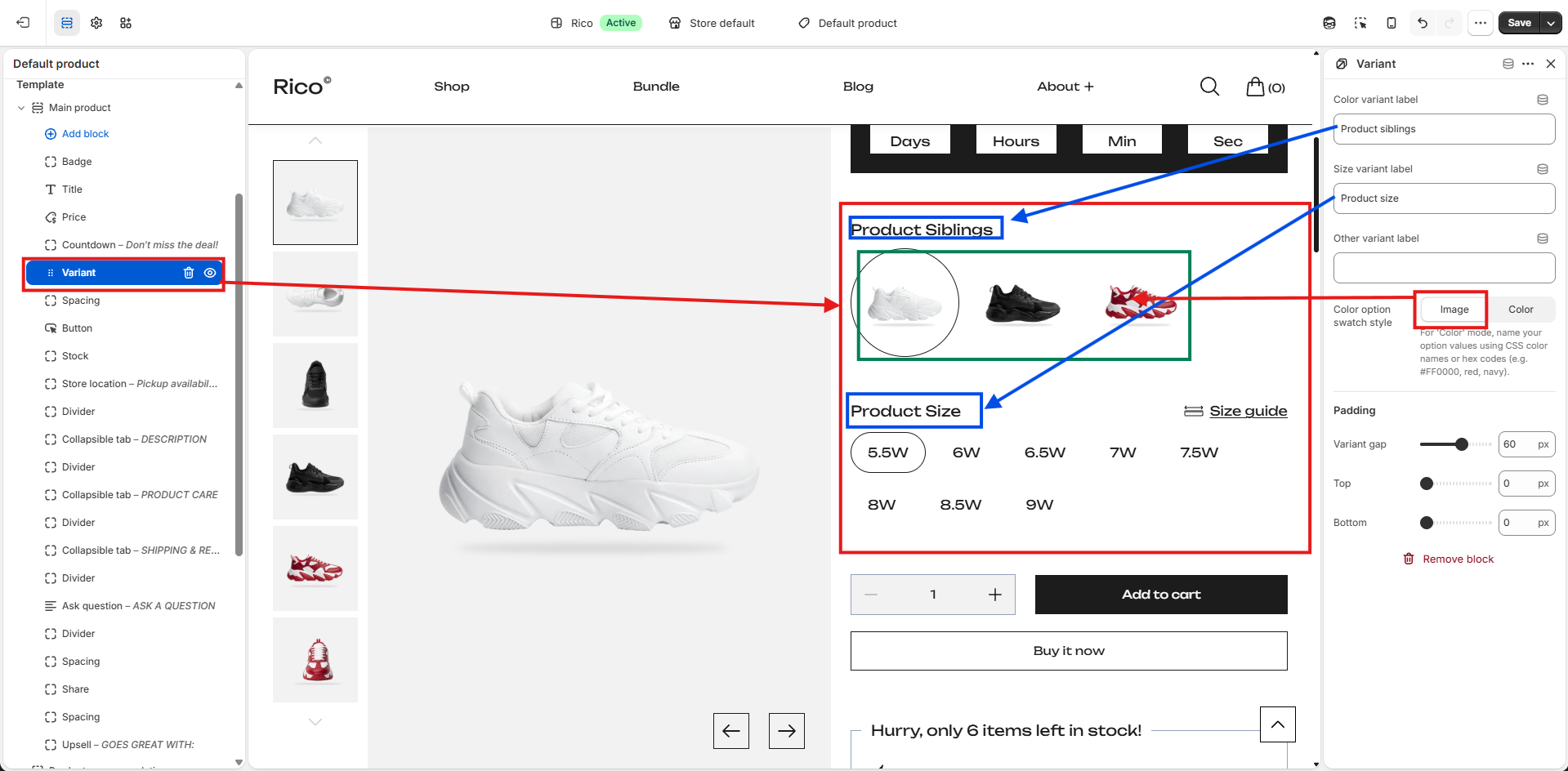
- Variant Gap: Controls the spacing between individual variant options.
- Padding Top: Adds space above the variant block.
- Padding Bottom: Adds space below the variant block.
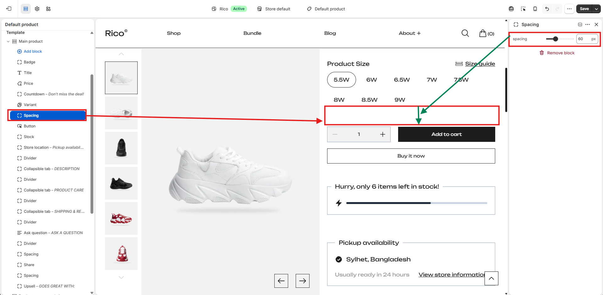
Spacing Block
Adds adjustable vertical space between blocks to improve layout and create visual separation between product information, buttons, and other content.
- Spacing: Controls the amount of vertical space displayed below the block.
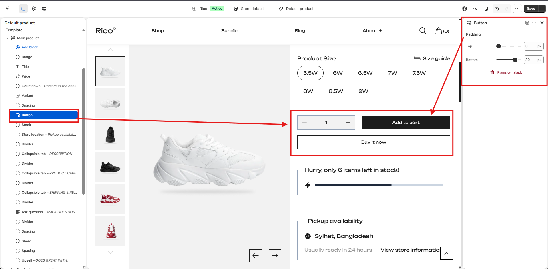
Button Block
Displays the primary purchase actions for the product, including the Add to Cart and Buy it now buttons.
- Add to Cart: Adds the selected product variant and quantity to the shopping cart.
- Buy it now: Redirects customers directly to the checkout page using Shopify's dynamic checkout feature, allowing for a faster purchasing experience.
- Padding Top: Adds space above the button block.
- Padding Bottom: Adds space below the button block.
Stock Information Block
Displays the current inventory status and a visual stock progress indicator to create urgency for low-stock products.
- Minimum Stock Alert: Defines the inventory threshold at which the stock message is displayed. For example, if set to 10, the stock alert appears only when inventory falls to 10 units or fewer.
- Padding Top: Adds space above the block.
- Padding Bottom: Adds space below the block.
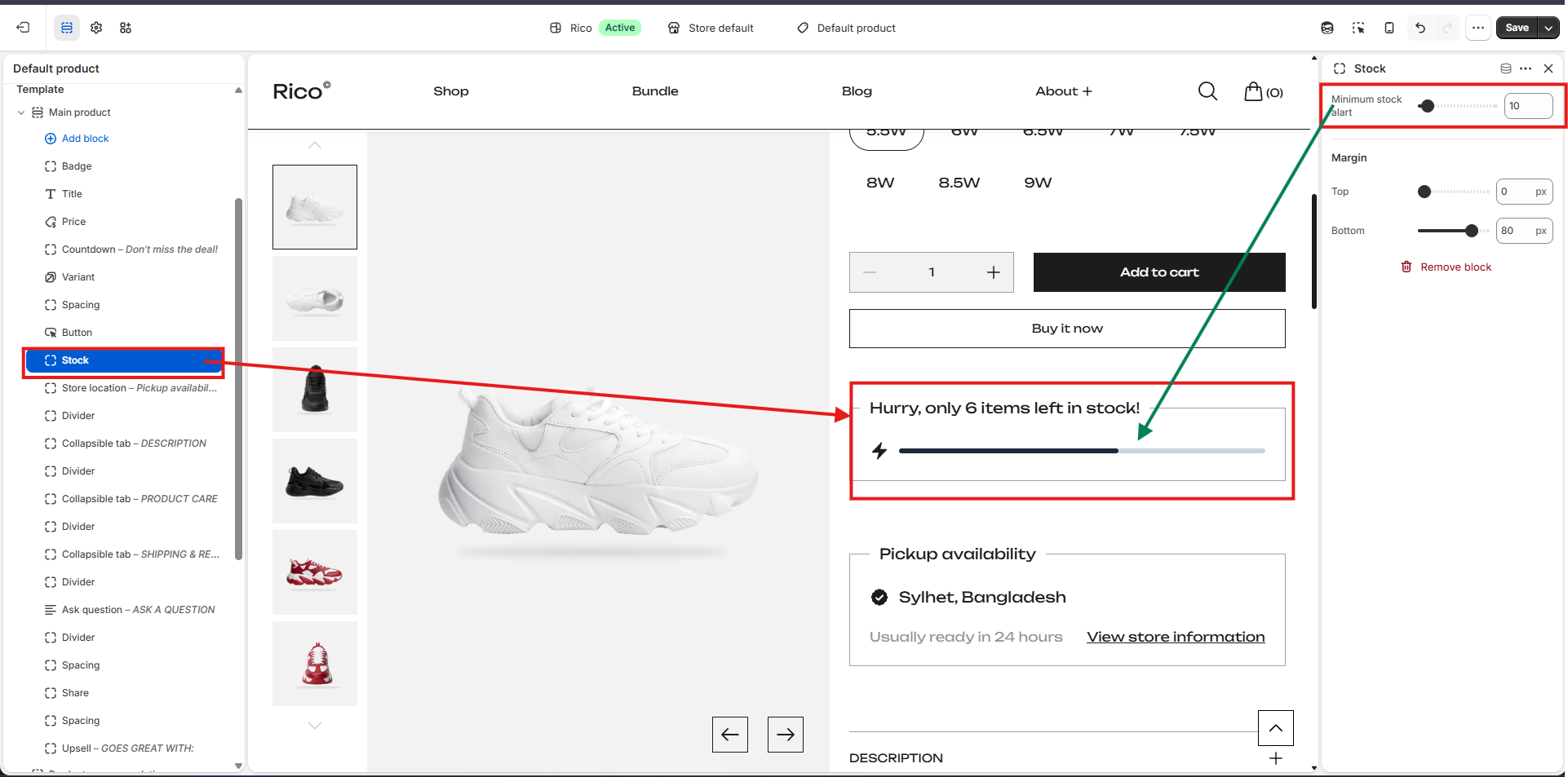
The block displays the remaining inventory count and a progress bar representing available stock. It automatically hides when inventory exceeds the configured threshold.
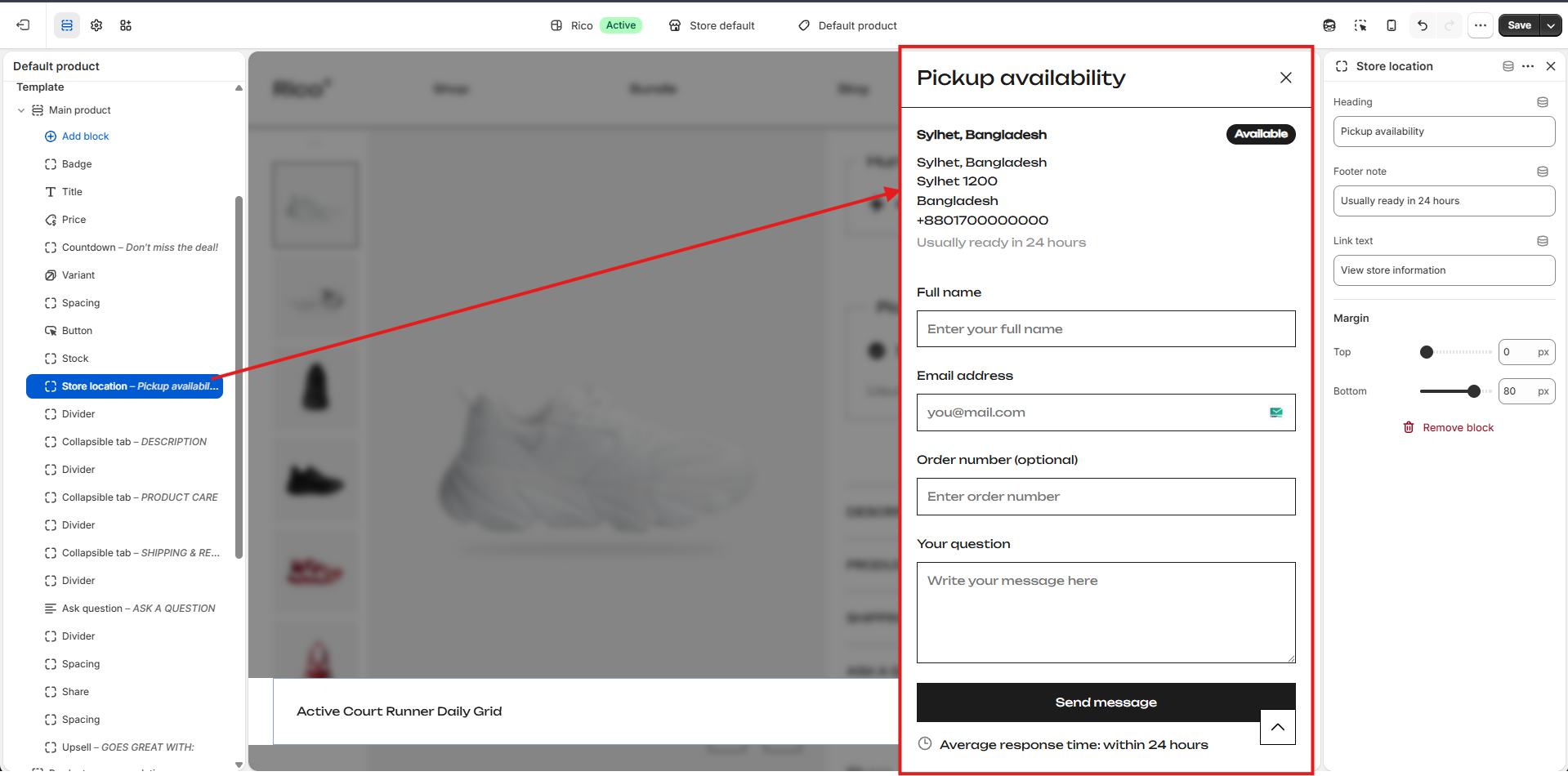
Store Location Block
Displays store pickup availability for the selected product. Customers can view the pickup location, estimated pickup time, and access additional store information via a drawer containing the store address, contact details, availability status, and a contact form.
- Heading: Customize the heading displayed above the pickup availability section. Default: Pickup availability.
- Footer Note: Customize the pickup availability message displayed beneath the store location. Default: Usually ready in 24 hours.
- Link Text: Customize the text displayed for the store information link. Default: View store information.
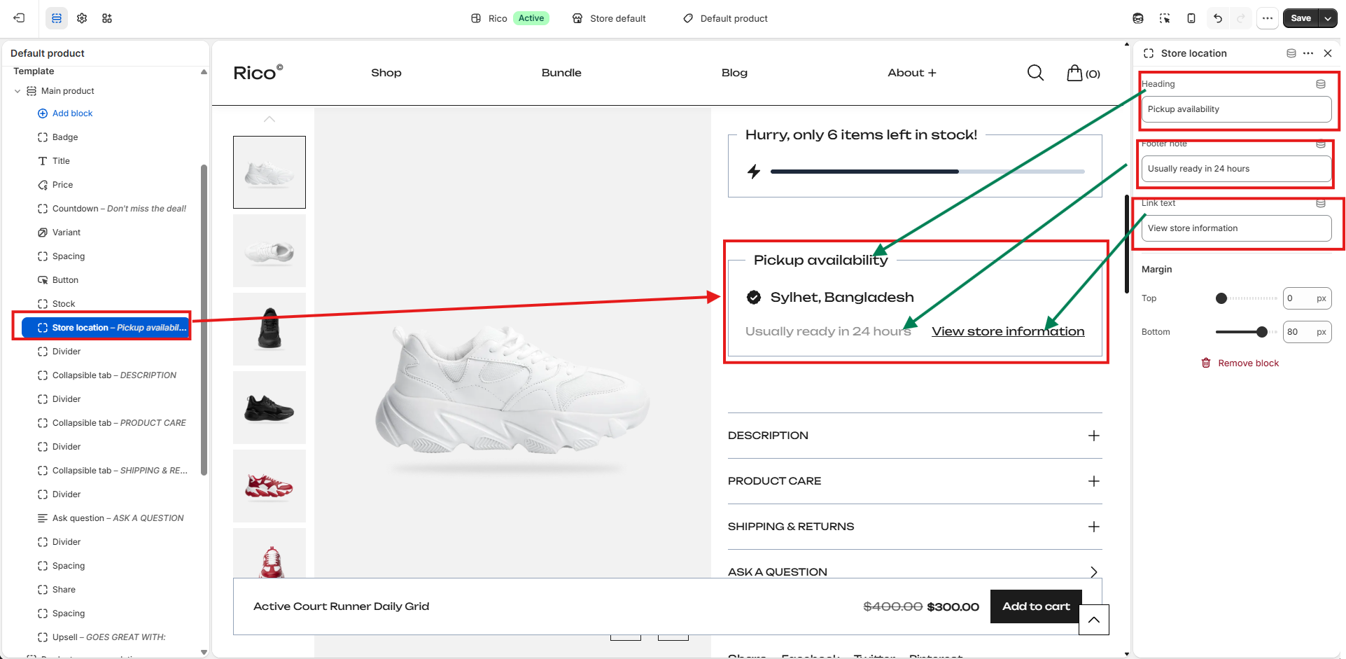
- Margin Top: Adds space above the Store Location block.
- Margin Bottom: Adds space below the Store Location block.
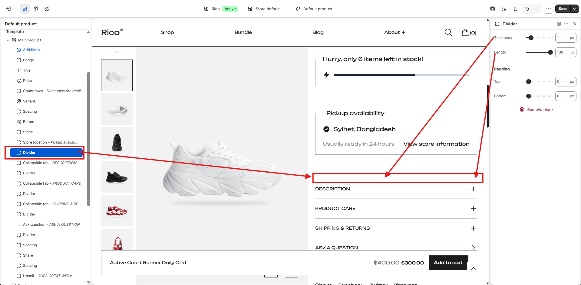
Divider Block
Inserts a horizontal divider between blocks to separate content visually and improve the overall layout. Useful for separating sections such as stock information, pickup availability, and collapsible tabs.
- Thickness: Controls the thickness of the divider line.
- Length: Controls the width of the divider as a percentage of the available content width.
- Padding Top: Adds space above the divider.
- Padding Bottom: Adds space below the divider.
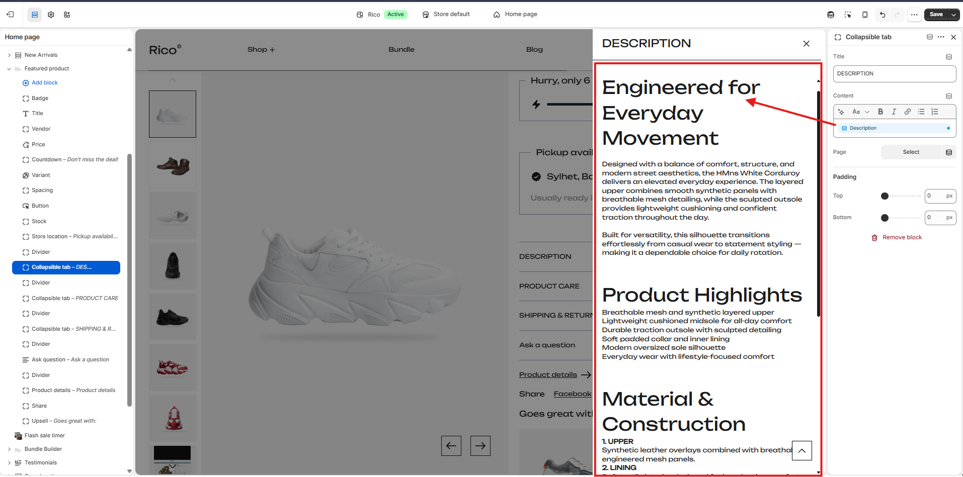
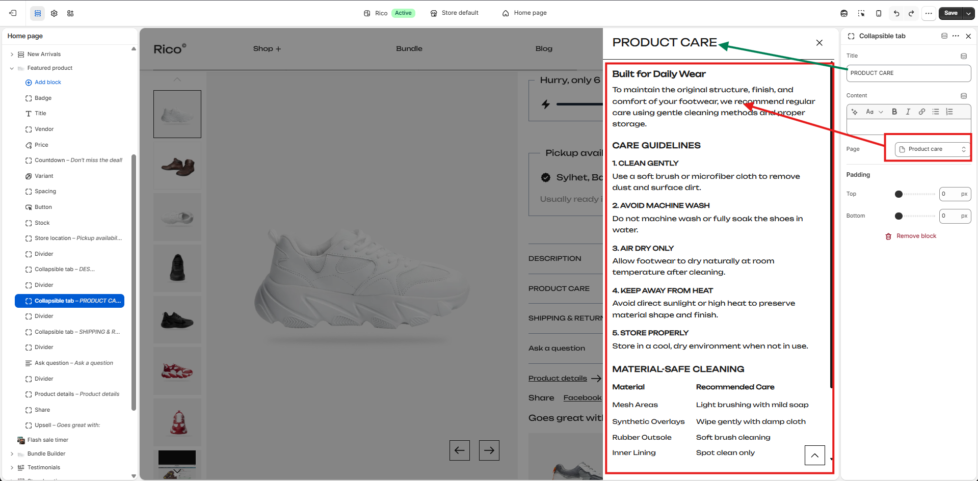
Collapsible Tab Block
Displays expandable sections that help organize product information without overwhelming the product page. Customers click a tab title to open a side drawer containing additional content. Common uses include product descriptions, care instructions, shipping information, warranty details, and FAQs.
- Title: Defines the heading displayed for the collapsible tab. Default: Tab title. Examples: Description, Product Care, Shipping & Returns, Materials, Warranty, FAQs.
- Content: Adds the information displayed when the customer opens the tab. Supports headings, bold, italic, hyperlinks, ordered lists, and unordered lists.
- Page: Select an existing page from your store to display its content inside the collapsible drawer — useful for reusing content such as a Size Guide, Shipping Policy, or Warranty Information across multiple products.
- Padding Top: Adds space above the collapsible tab block.
- Padding Bottom: Adds space below the collapsible tab block.
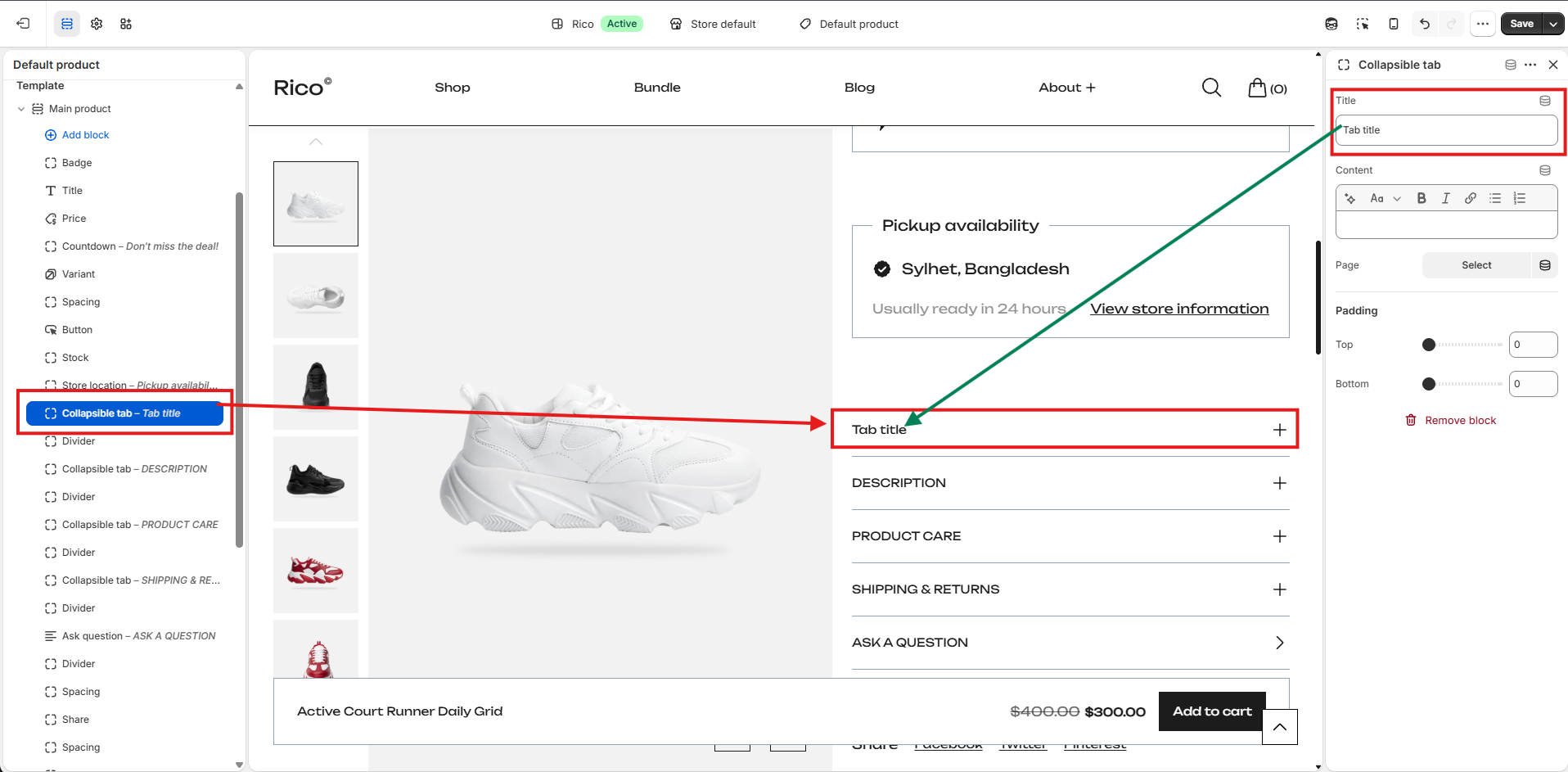
Select an existing page from your store to display its content inside the collapsible drawer. This option is useful for reusing content across multiple products, such as a Size Guide, Shipping Policy, Return Policy, Warranty Information, or Product Care Guide.
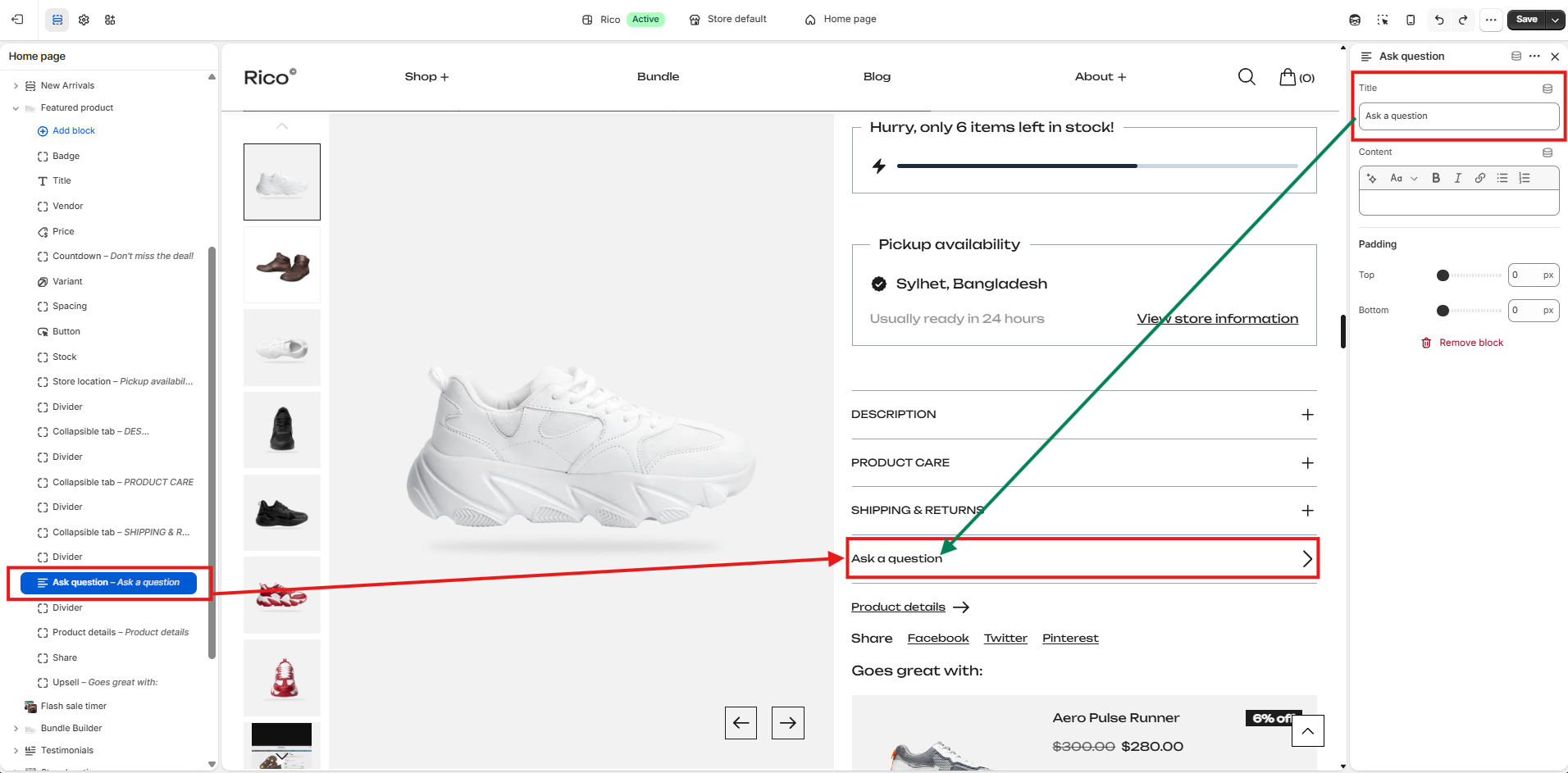
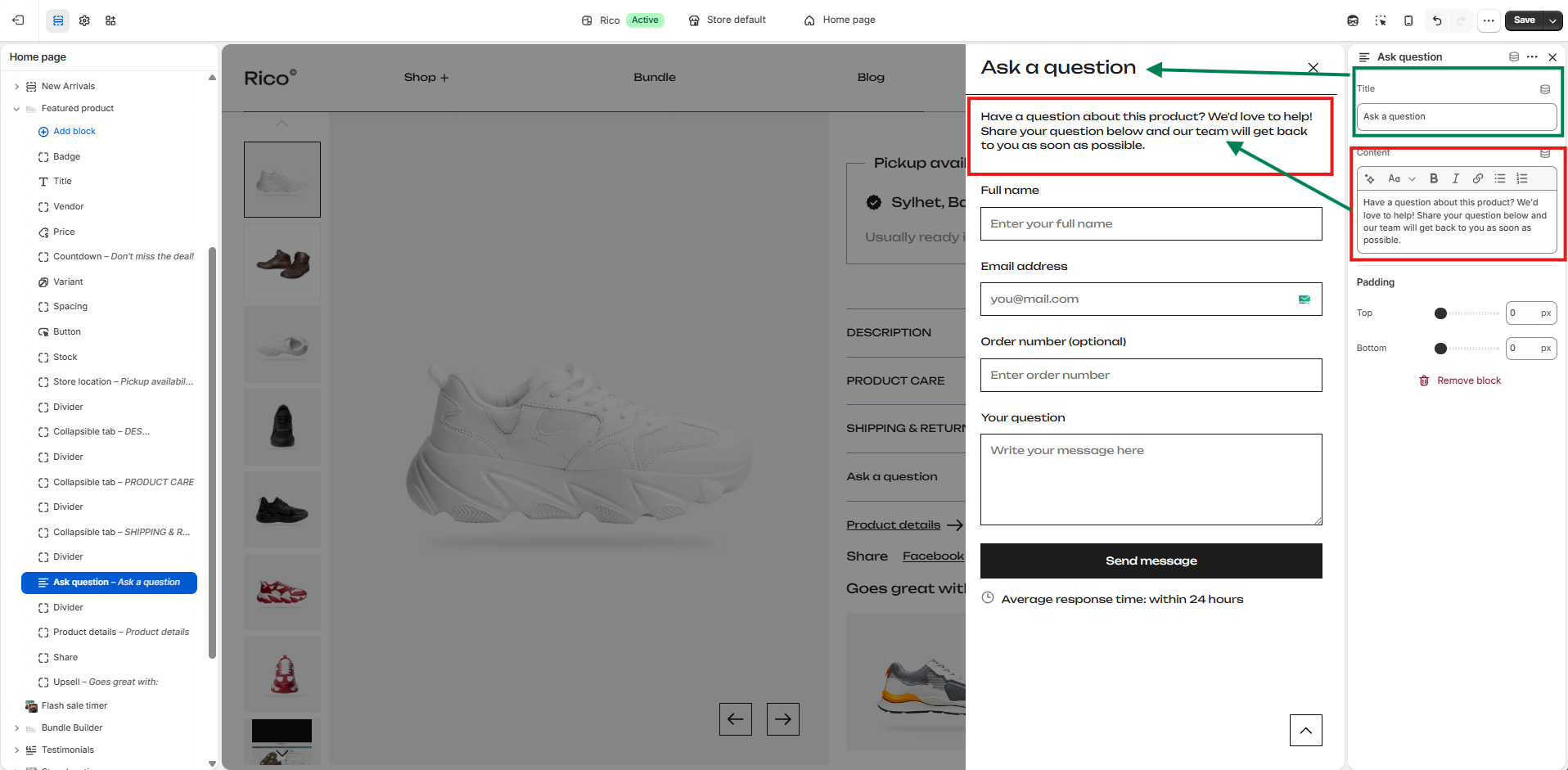
Ask a Question Block
Allows customers to contact your store directly from the product page. When clicked, it opens a side drawer containing a contact form where customers can submit their inquiries. This helps customers get additional product information before purchasing, improving confidence and reducing purchase hesitation.
- Title: Customize the heading displayed for the block on the product page. Default: Ask a question.
- Content: Add a short message that appears at the top of the question drawer.
- Padding Top: Adds space above the block.
- Padding Bottom: Adds space below the block.
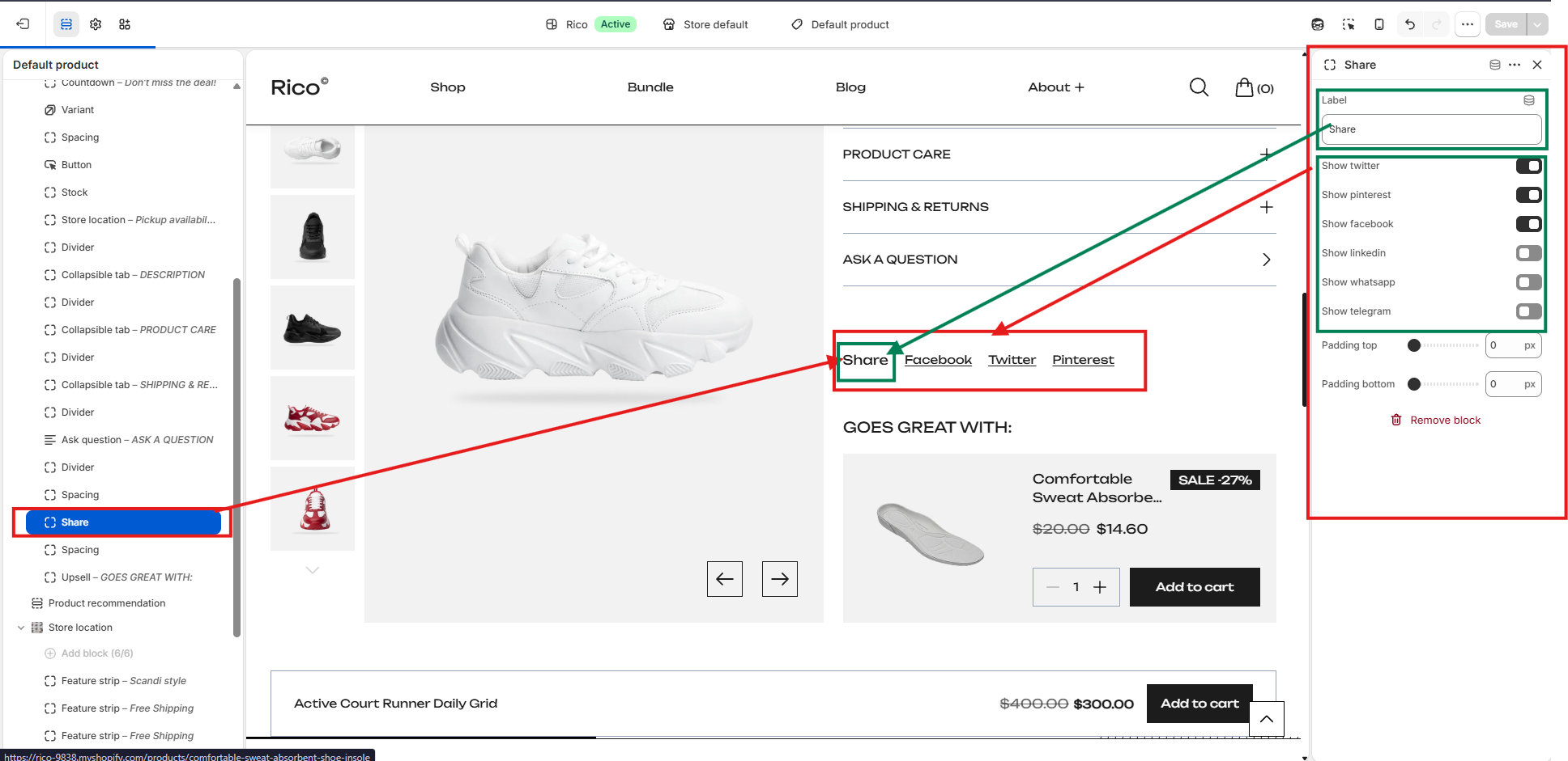
Share Block
Allows customers to share the current product on their preferred social media platforms directly from the product page. Sharing products on social media helps increase product visibility and drive additional traffic to your store.
- Label: Customize the heading displayed above the social sharing links. Default: Share.
- Social Media Platforms: Enable or disable each platform independently. Available options: Twitter, Pinterest, Facebook, LinkedIn, WhatsApp, Telegram.
- Padding Top: Adds space above the Share block.
- Padding Bottom: Adds space below the Share block.
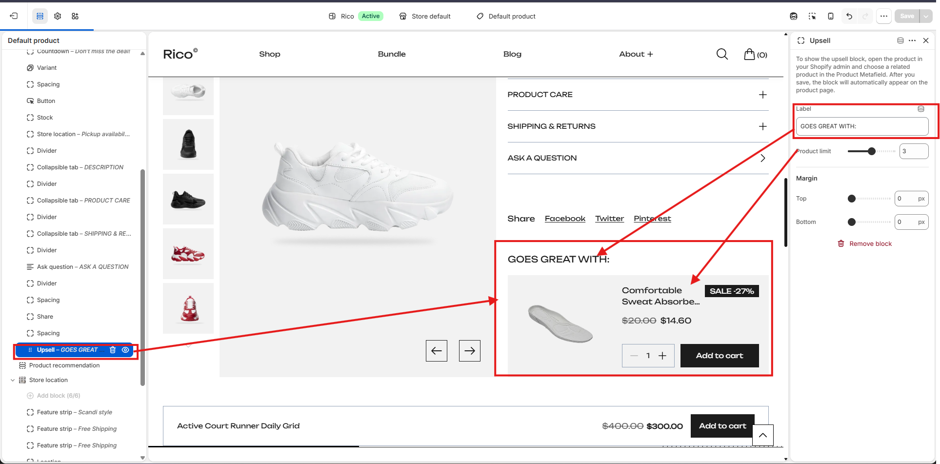
Upsell Block
Recommends related products directly on the product page, making it easy for customers to discover complementary items and add them to their cart. Products displayed in this block are pulled from the Related Products metafield assigned to each product in your Shopify Admin.
- Label: Customize the heading displayed above the recommended products.
- Product Limit: Choose the maximum number of related products to display. Options: 1–10 products. Default: 1.
- Margin Top: Adds space above the Upsell block.
- Margin Bottom: Adds space below the Upsell block.
How to Add Upsell Products
- In your Shopify Admin, go to Products.
- Open the product you want to edit.
- Locate the Related Products metafield.
- Select one or more products you want to recommend.
- Save the product.
- Open the Theme Editor and add the Upsell Block to the Product section if it has not already been added.
Each recommended product displays a product image, title, price (including sale price if applicable), discount badge (when available), quantity selector, and an Add to Cart button — allowing customers to purchase complementary products with just a few clicks. If no related products are assigned, the Upsell block will not appear on the product page.